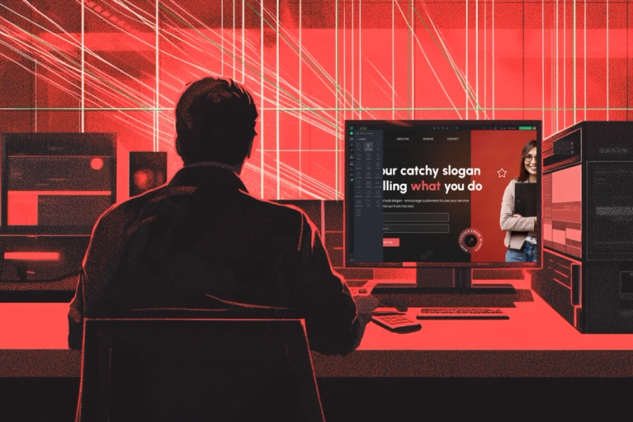
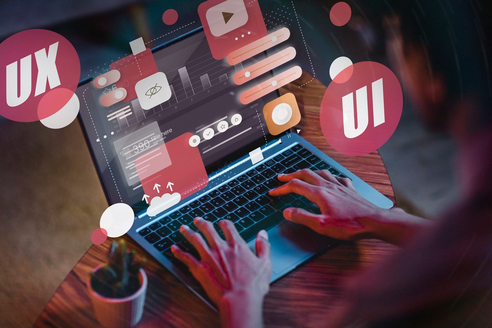
Web design-ul este mai mult decât simpla aranjare a elementelor pe un ecran—este o fuziune de artă, tehnologie și psihologie a utilizatorului. Într-o epocă în care prezența digitală este esențială, un website bine proiectat acționează ca o punte între mărci și audiență, oferind o primă impresie care poate defini succesul sau eșecul. De la tipografie la scheme de culori, fiecare detaliu influențează angajamentul, făcând web design-ul un aspect fundamental al comunicării digitale.
La baza sa, web design-ul este arta de a organiza spații digitale pentru a optimiza interacțiunea utilizatorului. Implică structurarea conținutului, selectarea tipografiei, integrarea multimedia-ului și asigurarea unui design responsiv pentru compatibilitate pe diverse dispozitive. Web design-ul eficient prioritizează claritatea, consistența și accesibilitatea, asigurând că utilizatorii navighează intuitiv fiind în același timp vizual angajați.
Istoria Web Design-ului
Web design-ul a suferit o transformare remarcabilă din primele zile ale internetului. Primele website-uri din începutul anilor 1990 erau pur și simplu bazate pe text, construite folosind structuri HTML simple. Pe măsură ce tehnologia a avansat, designerii au început să încorporeze imagini, tabele și stiluri de bază cu introducerea CSS-ului la sfârșitul anilor 1990. Începutul anilor 2000 a văzut ascensiunea Flash-ului, permițând experiențe web mai interactive și animate. Cu toate acestea, Flash a declinat din cauza preocupărilor legate de accesibilitate și securitate, dând naștere standardelor web moderne precum HTML5, CSS3 și framework-uri JavaScript.
"Design nu este doar felul în care arată și se simte. Design este felul în care funcționează." - Steve Jobs
Odată cu apariția design-ului responsive în anii 2010, site-urile web au devenit mai adaptabile la dimensiuni diferite ale ecranului, îmbunătățind experiențele utilizatorilor pe diverse dispozitive. Astazi, web design-ul se caracterizează prin estetică minimalistă, principii UX/UI, îmbunătățiri conduse de AI și elemente interactive care fac navigarea mai captivantă. Această evoluție continuă continuă să împingă limitele creativității și funcționalității digitale.
Nașterea Web-ului (1989-1995)
World Wide Web a fost inventat de Tim Berners-Lee în 1989 în timp ce lucra la CERN. Primul website din istorie, publicat în 1991, era o pagină simplă bazată pe text care oferea informații despre proiect. În această etapă timpurie, web design-ul era minimalist și pur funcțional. Site-urile web erau compuse în principal din text simplu, folosind doar HTML de bază. Fundurile erau gri, link-urile erau albastre și subliniate, și nu existau imagini sau elemente de stilizare disponibile. Pe măsură ce paginile web au devenit mai structurate, au apărut layout-uri bazate pe tabele, permițând o mai bună organizare a conținutului, deși încă limitate în flexibilitatea design-ului.
Ascensiunea Design-ului Vizual (1995-2000)
Cu introducerea CSS (Cascading Style Sheets) în 1996, designerii au câștigat mai mult control asupra stilizării paginilor web. JavaScript a apărut de asemenea, permițând elemente interactive. Tehnologia Flash, dezvoltată de Macromedia, a devenit un instrument popular pentru crearea animațiilor și a site-urilor web interactive, aducând un nou nivel de angajament vizual. sfârșitul anilor 1990 a fost marcat de creșterea layout-urilor bazate pe tabele ca abordare standard pentru web design, oferind mai mult control asupra structurii paginii. Multe site-uri web prezentau text intermitent și marquee-uri derulante, adăugând o senzație de mișcare unei experiențe web în caz contrar statice.
Revoluția Web 2.0 (2000-2010)
Începutul anilor 2000 a marcat tranziția către designul centrat pe utilizator, interactivitate și partajare de conținut. Mișcarea Web 2.0 a pus accentul pe ușurință în utilizare și angajament, influențând modul în care site-urile web au fost construite. Layout-urile în grilă au devenit o abordare de design comună, permițând o structurare și organizare mai bună a conținutului. Utilizarea colțurilor rotunjite, gradienților și umbrelor proiectate a devenit o tendință vizuală, conferind site-urilor web un aspect mai rafinat. Platformele de blogging precum WordPress și Blogger au câștigat popularitate, făcând crearea de conținut mai accesibilă. Creșterea platformelor de media socială, cum ar fi Facebook, YouTube și Twitter, a modelat în continuare web design-ul, deoarece site-urile web au început să încorporeze mai multe elemente interactive și dinamice. Accesul mobil la web s-a intensificat semnificativ, deși majoritatea site-urilor web nu erau încă optimizate pentru ecrane mai mici.
Era designului receptiv și prioritar pentru dispozitivele mobile (2010-2020)
Pe măsură ce smartphone-urile au devenit modul dominant prin care utilizatorii accesau internetul, web design-ul s-a îndreptat către layout-uri responsive care puteau să se adapteze la dimensiuni diferite ale ecranului. Conceptul de responsive web design (RWD) a apărut, utilizând grile flexibile, imagini scalabile și media queries pentru a asigura o experiență fără cusur pe toate dispozitivele. Declinul Flash-ului a devenit evident, deoarece a fost treptat înlocuit de HTML5, CSS3 și JavaScript pentru performanță mai bună și compatibilitate între dispozitive. Skeuomorphismul, care imita texturile și obiectele din lumea reală, a cedat locului flat design-ului, favorizând o estetică mai curată și minimalista. Site-urile web au devenit mai rapide, prioritizând experiența utilizatorului, accesibilitatea și navigarea intuitivă, pe măsură ce motoarele de căutare precum Google au pus accentul pe indexarea mobile-first.
Web-ul Modern (2020-Prezent)
Peisajul design-ului web actual prioritizează viteza, accesibilitate, interactivitate și experiențe bazate pe AI. Dark mode a devenit o funcție adoptată pe scară largă, permițând utilizatorilor să comute între teme luminoase și întunecate pentru o mai bună lizibilitate și confort al utilizatorului. Designul UI minimalist, caracterizat prin tipografie simplă, spații albe și aspecturi streamlined, dominează tendințele web moderne. Instrumentele de design bazate pe AI, cum ar fi Figma și Webflow, au făcut crearea de site-uri web mai eficientă și accesibilă, permițând designerilor să prototipeze și să construiască site-uri web vizual dinamice fără codare extinsă. Optimizarea pentru căutare vocală a devenit din ce în ce mai importantă, pe măsură ce asistenții inteligenți precum Siri și Alexa modelează modul în care utilizatorii interacționează cu conținutul digital. Integrarea elementelor 3D, micro-interacțiunilor și experiențelor imersive continuă să împingă limitele a ceea ce este posibil în design-ul web. În plus, performanța, securitatea și accesibilitatea rămân priorități cheie pentru crearea de experiențe web inclusive și eficiente.
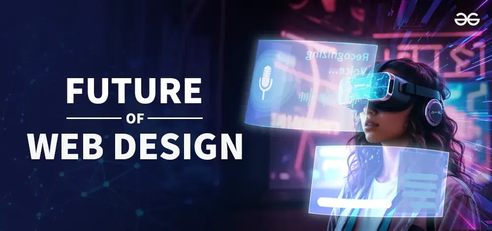
Viitorul Design-ului Web
Cu tehnologiile în curs de apariție precum AI, AR/VR și Metaverse-ul, design-ul web va continua să evolueze în moduri captivante. Platformele no-code și instrumentele de automatizare vor democratiza în continuare capacitatea de a crea site-uri web, făcând dezvoltarea web mai accesibilă pentru o audiență mai largă. Personalizarea și designul adaptiv vor deveni mai sofisticate, personalizând experiențele utilizatorului pe baza comportamentului și preferințelor. Pe măsură ce peisajurile digitale continuă să se schimbe, design-ul web va rămâne un domeniu dinamic și în continuă schimbare, condus de creativitate, progrese tehnologice și nevoi ale utilizatorului.
"Responsive web design nu este doar despre adaptarea conținutului; este despre crearea unei experiențe utilizatorului fără cusur." - Ethan Marcotte
De la începuturile paginilor statice de text până la experiențele actuale, extrem de interactive și bazate pe inteligență artificială, proiectarea web a suferit o transformare remarcabilă. Evoluția sa reflectă o căutare continuă a inovației, combinând funcționalitatea și estetica pentru a crea experiențe digitale captivante.

Proiectanți web notabili și operele lor
Mai mulți artiști au lăsat o amprentă semnificativă în industria proiectării web. Iată câțiva dintre acești personaje notabili:
Jeffrey Zeldman: Un pionier al standardelor web, Zeldman a jucat un rol esențial în promovarea celor mai bune practici în proiectarea și dezvoltarea web. A fost cofondatorul Proiectului pentru Standarde Web și autorul cărții "Designing with Web Standards". Influența sa se extinde și în promovarea unei proiectări web accesibile și semantice, asigurându-se că site-urile moderne sunt în același timp prietenoase cu utilizatorul și tehnice solide. Prin activitatea sa la A List Apart, a inspirat numeroși proiectanți și dezvoltatori să adopte cele mai bune practici în fluxurile lor de lucru.
Ethan Marcotte: Arhitectul proiectării web responsive, Marcotte a introdus tehnici care asigură adaptabilitatea site-urilor web la diferite dimensiuni de ecran, revoluționând abordarea mobile-first. Conceptul său de grile fluide, imagini flexibile și interogări media a transformat modul în care sunt construite site-urile web, permițând proiectanților să creeze machete care funcționează fără probleme pe diverse dispozitive. Contribuțiile sale continuă să fie un principiu fundamental în proiectarea web modernă, influențând framework-uri precum Bootstrap și Foundation.
Karen McGrane: O voce de frunte în strategia de conținut și design UX, McGrane a lucrat extensiv pentru a îmbunătăți accesibilitatea și experiențele utilizatorilor pe platformele digitale. Ea subliniază importanța conținutului structurat, asigurând că informațiile sunt prezentate eficient pe diferite medii. Munca ei de susținere a practicilor de design incluziv a ajutat la modelarea experiențelor digitale care sunt mai prietenoase pentru utilizatorii cu dizabilități, consolidând necesitatea accesibilității ca componentă de bază a designului web.
Brad Frost: Cunoscut pentru munca sa în designul atomic, Frost a contribuit semnificativ la crearea sistemelor de design scalabile și modulare, ajutând designerii să dezvolte interfețe web mai coerente și ușor de întreținut. Abordarea sa descompune designul în componente mai mici reutilizabile, făcând dezvoltarea web mai eficientă și adaptabilă. Metodologiile sale au influențat sistemele de design la nivel enterprise, permițând companiilor să mențină consistența brandului pe platformele digitale în timp ce favorizează inovația.
Vitaly Friedman: În calitate de co-fondator al Smashing Magazine, Friedman a jucat un rol crucial în educarea și inspirarea designerilor web din întreaga lume prin publicațiile și conferințele sale. Munca sa oferă perspective în profunzime asupra tendințelor moderne în designul web, principiilor de utilizabilitate și tehnologiilor emergente. Prin intermediul Smashing Magazine, el a construit o vastă comunitate de schimb de cunoștințe care a modelat evoluția designului web, făcând expertiza din industrie mai accesibilă designerilor de toate nivelurile.
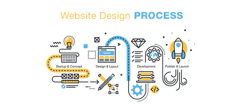
Proces de lucru
Designul web este un proces intricate care combină creativitatea, funcționalitatea și tehnologia pentru a produce medii digitale atrăgătoare vizual și cu interactivitate ridicată. Aceasta necesită planificare atentă, direcție artistică și expertize tehnică pentru a asigura o experiență optimă a utilizatorului. De la conceptualizare la execuție, fiecare fază a fluxului de lucru în design joacă un rol crucial în crearea interfețelor web fără probleme și eficiente.
Material și Instrumente
Fundamentul oricărui proiect de web design constă în selectarea instrumentelor și materialelor care le permit designerilor să traducă ideile lor creative în experiențe digitale tangibile. Software de design sofisticat, cum ar fi Adobe Photoshop, Illustrator și Figma, servește ca platformă primară pentru crearea wireframe-urilor, dezvoltarea compoziții lucrate și generarea de prototipuri interactive. Aceste aplicații oferă designerilor o flexibilitate fără egal, permițându-le să experimenteze cu tipografie, teoria culorilor și structurarea aspectului.
Dincolo de designul vizual, limbajele de programare, cum ar fi HTML, CSS și JavaScript, joacă un rol fundamental în a insufla viață în designurile conceptuale. HTML structurează fundamentul unui site web, CSS îi îmbunătățește atractivitatea estetică, iar JavaScript introduce interactivitate, făcând paginile web dinamice și captivante. Sistemele de gestiune a conținutului (CMS), cum ar fi WordPress și Webflow, raționalizează procesul de dezvoltare, permițând designerilor să creeze și să gestioneze site-uri web cu o eficiență și o precizie mai mare.
Peisajul digital în continuă evoluție a introdus, de asemenea, instrumente cu inteligență artificială și platforme de colaborare în cloud care au revoluționat modul în care lucrează designerii. Instrumentele de design asistată de AI facilitează prototiparea rapidă, în timp ce soluțiile bazate pe cloud permit colaborarea în timp real între designeri, dezvoltatori și clienți. Aceste progrese nu numai că îmbunătățesc eficiența fluxului de lucru, ci stimulează și creativitatea prin eliminarea barierelor tehnice.
Tehnici de Lucru
Succesul unui proiect de web design este profund înrădăcinat în implementarea unor tehnici rafinate care îmbunătățesc funcționalitatea, utilizabilitatea și estetica. Una dintre cele mai adoptate metodologii pe scară largă este sistemul de aspecte bazat pe grilă, care asigură alinierea, proporția și consistența structurală pe diferite dimensiuni de ecran. Această abordare sistematică oferă o bază puternică pentru organizarea conținutului, rezultând într-o experiență de utilizator intuitivă și armonioasă.
Tipografia, contrastul și spațiul alb sunt elemente esențiale în optimizarea lizibilității și crearea unei aspecte vizual captivante. Tipografia selectată cu grijă îmbunătățește claritatea comunicării, în timp ce contrastul și spațiul alb ghidează atenția utilizatorului, prevenind supraîncărcarea cognitivă. În plus, interactivitatea este un aspect cheie al web design-ului modern, cu animații, efecte hover și micro-interacțiuni adăugând o dimensiune captivantă și imersivă interfețelor digitale.
Designul responsive a devenit o piatră de temelie a dezvoltării web contemporane, asigurând că site-urile se adaptează fără probleme la diverse dispozitive și dimensiuni de ecran. Prin utilizarea structurilor de rețea flexibile, imaginilor scalabile și a interogărilor media CSS, designerii creează experiențe digitale care rămân consecvente pe desktop-uri, tablete și smartphone-uri. Această adaptabilitate îmbunătățește utilizabilitatea și asigură că site-urile respectă standardele moderne de accesibilitate.
Mai mult, principiile design-ului centrat pe utilizator (UCD) subliniază importanța testării utilizabilității, rafinării iterative și conformității cu accesibilitatea. Efectuarea cercetării utilizatorului, strângerea feedback-ului și rafinarea prototipurilor sunt pași esențiali în asigurarea că site-urile se adresează audiențelor diverse. Practicile de design etic subliniază, de asemenea, importanța incluzivității, asigurând că platformele digitale se adaptează utilizatorilor cu abilități și nevoi variate.
În cele din urmă, designul web este o disciplină în continuă evoluție care combină expresia artistică cu inovația tehnologică. Prin valorificarea instrumentelor avansate, aplicarea metodologiilor strategice și prioritizarea experienței utilizatorului, designerii creează spații digitale care nu sunt doar captivante din punct de vedere vizual, ci și superioare din punct de vedere funcțional. Capacitatea de a echilibra creativitatea cu utilizabilitatea este ceea ce definește designul web exceptional, făcându-l un element esențial al lumii digitale.
Mediu Integrat și Context Cultural
Designul web nu este doar despre estetică și funcționalitate – este profund influențat de mediul în care este creat și de contextul cultural al utilizatorilor săi. Pe măsură ce experiențele digitale au devenit o parte esențială a vieții cotidiene, designerii trebuie să ia în considerare modul în care factori precum geografia, tradițiile, normele sociale și infrastructura tehnologică modelează așteptările utilizatorilor și interacțiunile acestora cu platformele digitale.
Influența Multiculturală în Designul Web
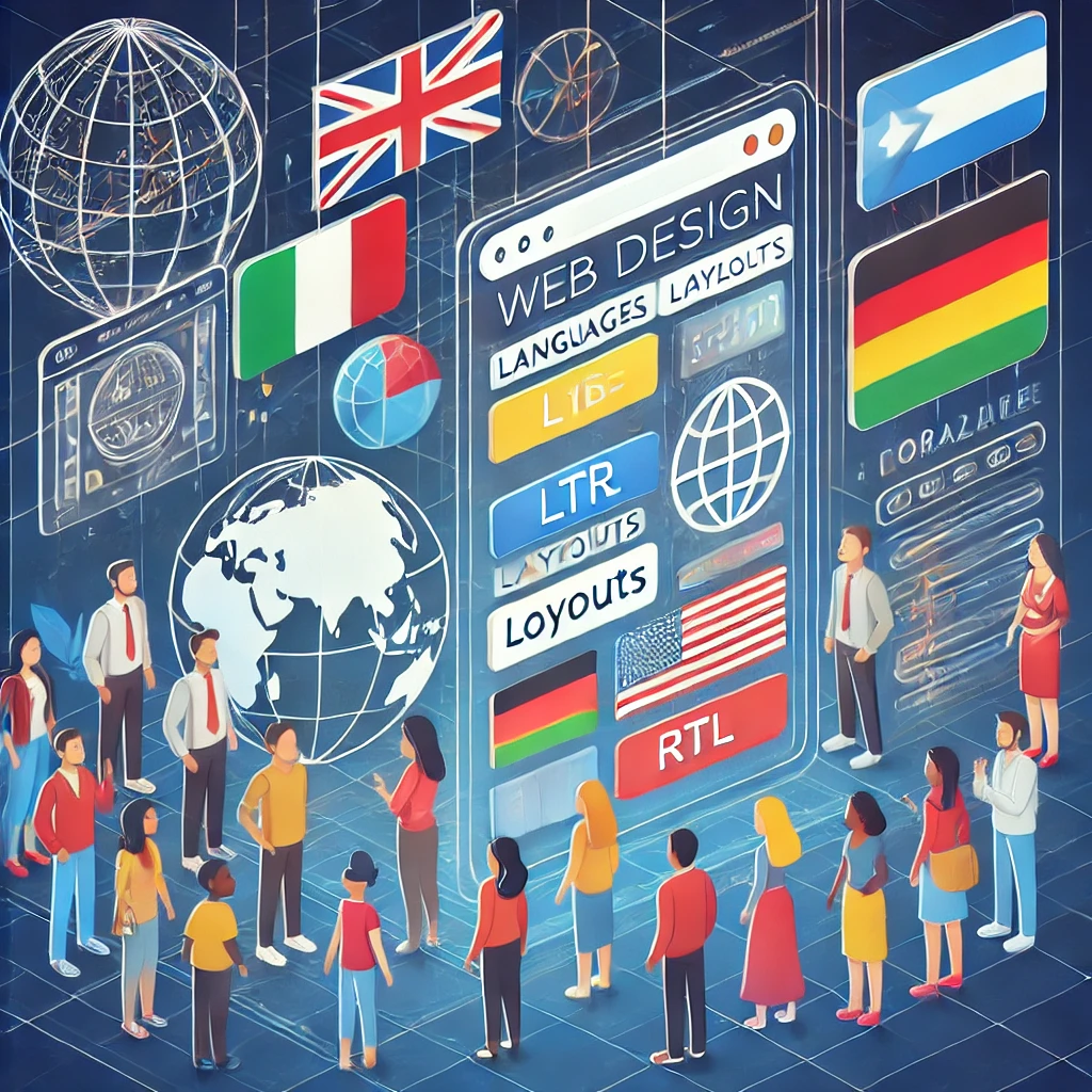
Un cadru multicultural în designul web asigură că experiențele digitale sunt incluzive, accesibile și cultural relevante pentru audiențe globale diverse. Merge dincolo de simpla traducere, încorporând adaptări vizuale, lingvistice și de utilizabilitate care respectă diferențele culturale. Elemente precum simbolistica culorilor, tipografia, stilurile de navigare și interacțiunile utilizatorului variază în funcție de regiuni și trebuie luate în considerare cu atenție. De exemplu, în timp ce utilizatorii occidentali sunt obișnuiți cu designuri minimaliste cu spații albe, unele piețe asiatice preferă aspecte dense, bogate în informații. În plus, limbile de la dreapta la stânga (RTL) precum arabă necesită interfețe în oglindă, în timp ce câmpurile formularelor trebuie să se adapteze la formate variate de nume și adrese în diferite culturi.
Proiectarea pentru utilizatori multiculturali înseamnă și asigurarea accesibilității, optimizarea pentru dispozitive mobile și experiențe de utilizator localizate. Multe regiuni se bazează pe conexiuni cu lățime de bandă redusă, necesitând soluții de design ușoare și responsive. Personalizarea bazată pe IA și interfețele adaptive pot îmbunătăți în continuare angajamentul utilizatorilor prin ajustarea limbii, conținutului și elementelor interfeței în funcție de preferințele regionale. Branduri globale precum Google, Airbnb și Amazon echilibrează cu succes branding-ul consistent cu experiențe localizate, adaptând sistemele de plată, imaginile și interacțiunile cu clienții la așteptări culturale diferite. Un cadru multicultural bine implementat nu doar îmbunătățește utilizabilitatea, ci promovează și incluziunea și angajamentul global într-o lume din ce în ce mai digitală.
Impact Social și Accesibilitate
Impactul social și accesibilitatea în designul web joacă un rol crucial în asigurarea că experiențele digitale sunt incluzive și benefice pentru toți utilizatorii, indiferent de abilități sau antecedente socio-economice. Prin prioritizarea accesibilității universale, designerii web pot elimina barierele care împiedică persoanele cu dizabilități să navigheze și să interacționeze cu site-urile web. Implementarea standardelor WCAG (Web Content Accessibility Guidelines), cum ar fi furnizarea textului alternativ pentru imagini, navigarea compatibilă cu tastatura și compatibilitatea cu cititorii de ecran, permite unei audiente mai largi să se angajeze cu conținutul digital. Dincolo de accesul pentru persoane cu dizabilități, designul web influențează și incluziunea socială, oferind oportunități egale pentru educație, locuri de muncă și comunicare în diferite comunități, inclusiv în regiunile lipsite de servicii cu acces internet limitat.
"O interfață de utilizator este ca o glumă. Dacă trebuie să o explici, nu e chiar bună." - Martin LeBlanc
Responsabilitatea socială a designului web se extinde la reducerea decalajelor digitale prin asigurarea că site-urile web funcționează eficient pe diverse dispozitive, viteze de internet și niveluri de alfabetizare. Proiectarea pentru medii cu lățime de bandă redusă cu cod ușor și resurse optimizate asigură că oamenii din zone rurale sau țări în dezvoltare pot accesa serviciile online esențiale. În plus, suportul multilingv și designul sensibil din punct de vedere cultural ajută utilizatorii din fundal diferit să se angajeze mai eficient cu conținutul. Considerațiile etice, cum ar fi confidențialitatea datelor, transparența și practicile UX incluzive, consolidează în continuare impactul social pozitiv al designului web prin fomentarea încrederii și promovarea experiențelor digitale echitabile. Când accesibilitatea și impactul social sunt prioritizate, designul web devine un instrument puternic pentru împuternicirea indivizilor și bridging-ul decalajelor societale într-o lume din ce în ce mai digitală.
Dezvoltare Profesională și Evoluția Industriei
Industria designului web a evoluat de la layout-uri simple pe bază de HTML la experiențe digitale extrem de interactive și alimentate de IA, necesitând profesioniștilor să se adapteze și să-și extindă continuu seturile de abilități. În primele zile, designerii web se concentrau în principal pe pagini statice și styling de bază, dar designul modern integrează acum principii UX/UI, accesibilitate, optimizarea performanței și elemente interactive. Pe măsură ce tehnologia avansează, învățarea continuă prin cursuri online, certificări și conferințe din industrie a devenit esențială pentru a rămâne competitiv. Platforme precum Figma, Webflow și instrumente de design alimentate de IA au redefinit și fluxurile de lucru, împingând designerii spre procese mai eficiente și automatizate.
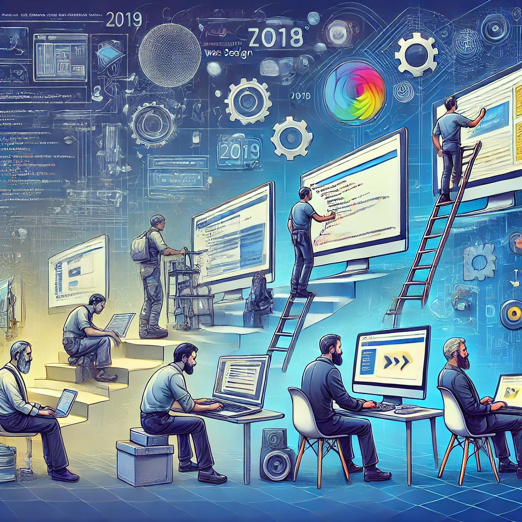
Evoluția industriei a transformant și modul în care site-urile web sunt construite și întreținute. Ascensiunea design-ului responsive, platformelor no-code și sistemelor bazate pe componente a deplasat focusul de la codarea tradițională către abordări de design modular și scalabil. Tendințele industriei pun acum accent pe design incluziv, implementarea etică a AI și dezvoltarea web sustenabilă, asigurând că experiențele digitale sunt accesibile și responsabile din punct de vedere medial. Cu tehnologii emergente cum ar fi AR, VR și personalizarea bazată pe AI, web designerii trebuie nu doar să se adapteze la progresele tehnologice, ci și să anticipeze modul în care comportamentul utilizatorului, standardele de accesibilitate și etica digitală vor modela viitorul web-ului.
Stiluri de Design Web
Stilurile de web design au evoluat semnificativ de-a lungul anilor, fiind influențate de progresele tehnologice, tendințele artistice și așteptările utilizatorilor. Fiecare stil are o abordare unică cu privire la layout, culoare, tipografie și interactivitate, modelând modul în care utilizatorii se angajează cu conținutul digital. Pe măsură ce întreprinderile și creatorii urmăresc să-și stabilească prezența online, stilurile de web design ajută la definirea brandingului, utilizabilității și experiențelor generale. Indiferent dacă un site îmbrățișează minimalismul, estetica experimentală îndrăzneață sau vibele retro nostalgice, stilul potrivit îmbunătățește angajarea utilizatorului și funcționalitatea. Mai jos sunt prezentate câteva dintre cele mai prominente stiluri de web design utilizate astazi, fiecare servind audiențe și obiective diferite în peisajul digital.
Design minimalist
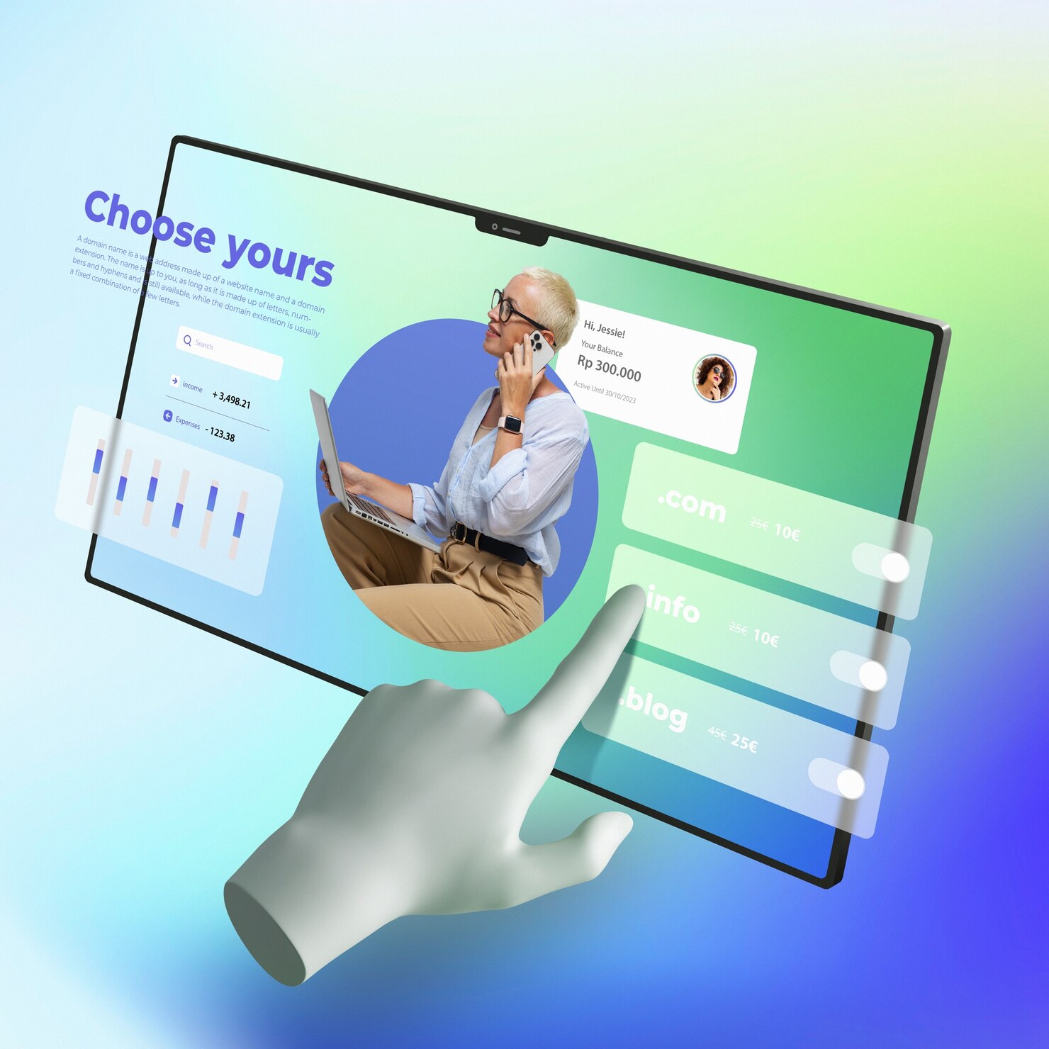
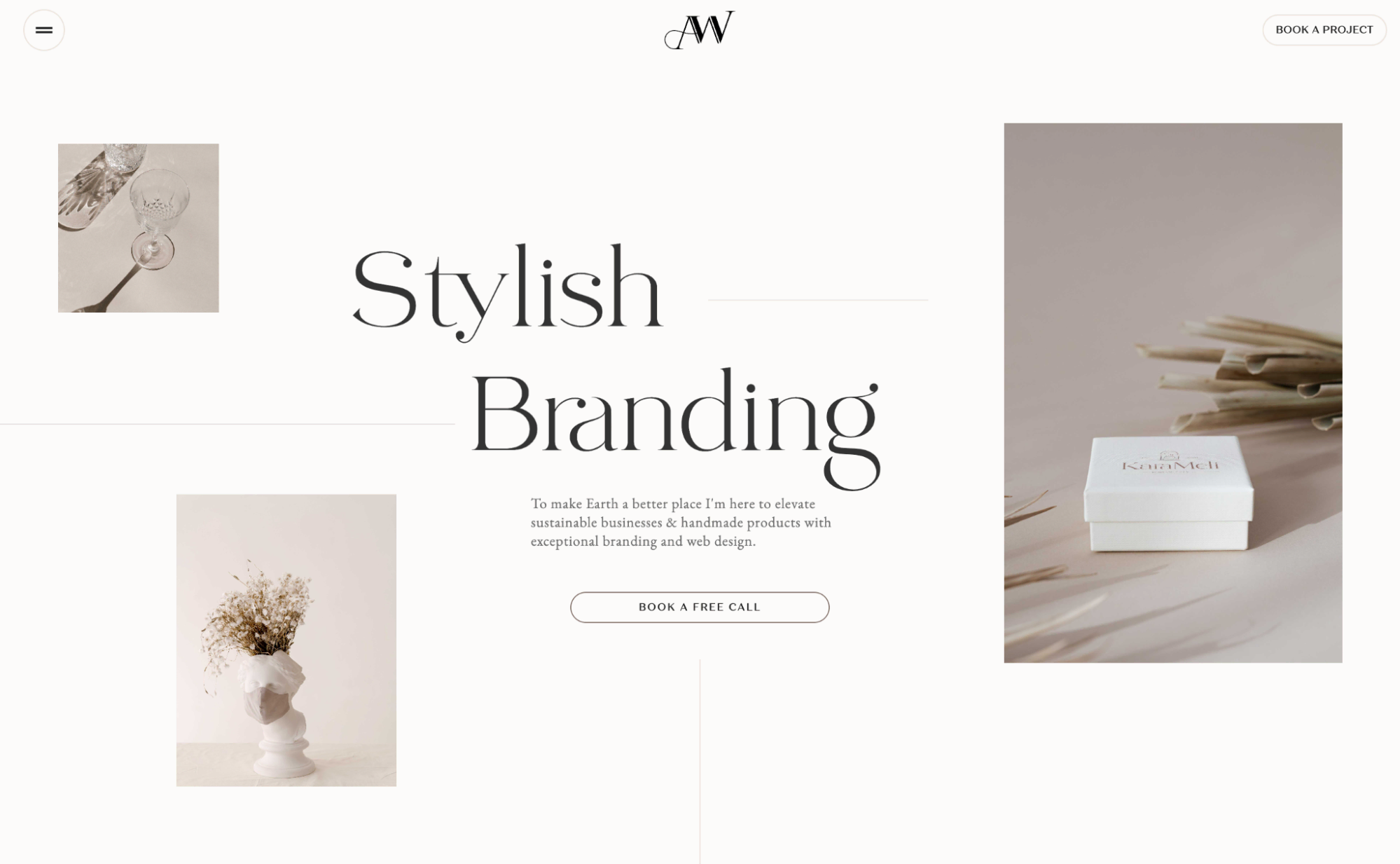
Design-ul minimalist se concentrează pe layout-uri curate, simplitate și funcționalitate prin eliminarea elementelor inutile și punerea accentului pe spațiul alb, lizibilitate și experiența utilizatorului. Îmbunătățește utilizabilitatea asigurând că cel mai important conținut rămâne în focus, reducând distragerile pentru vizitatori. Design-ul minimalist utilizează adesea scheme de culori monocrome, tipografie clară și layout-uri de grilă structurate pentru a crea o estetică elegantă și rafinată. Este utilizat pe scară largă pe site-urile corporate, portofolii și platformele de brand de înalt nivel, unde claritatea, sofisticarea și un ton profesional sunt esențiale. Prin prioritizarea timpilor de încărcare rapidi și a navigării fără probleme, site-urile web minimaliste oferă o experiență de utilizator lină și intuitivă care menține vizitatorii angajați.
Brutalist în Web Design
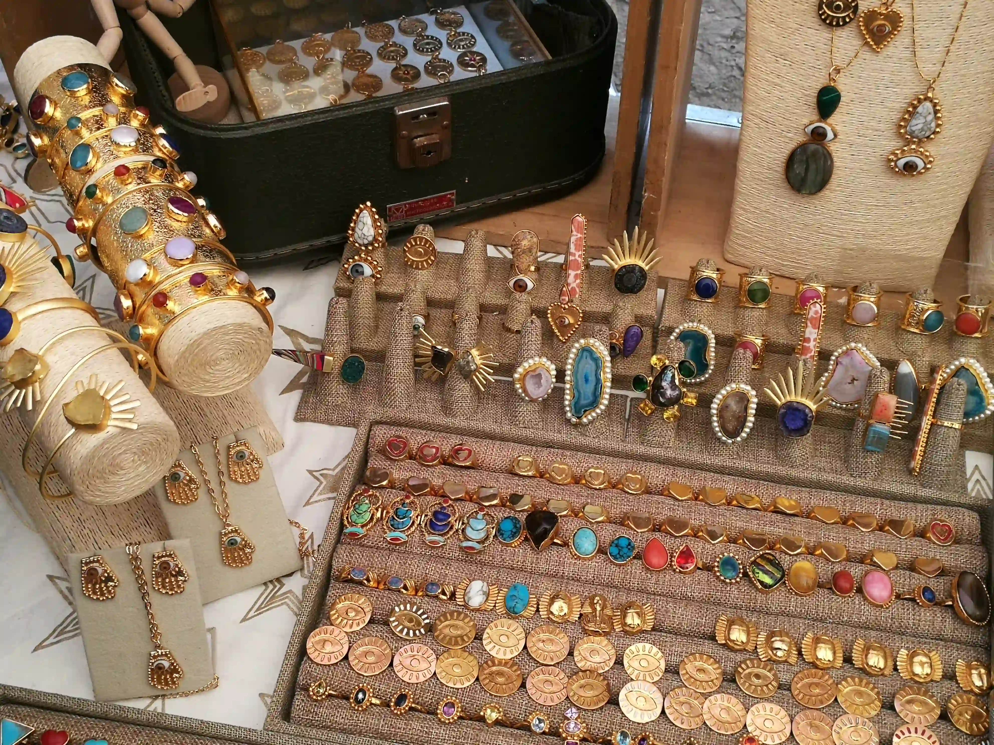
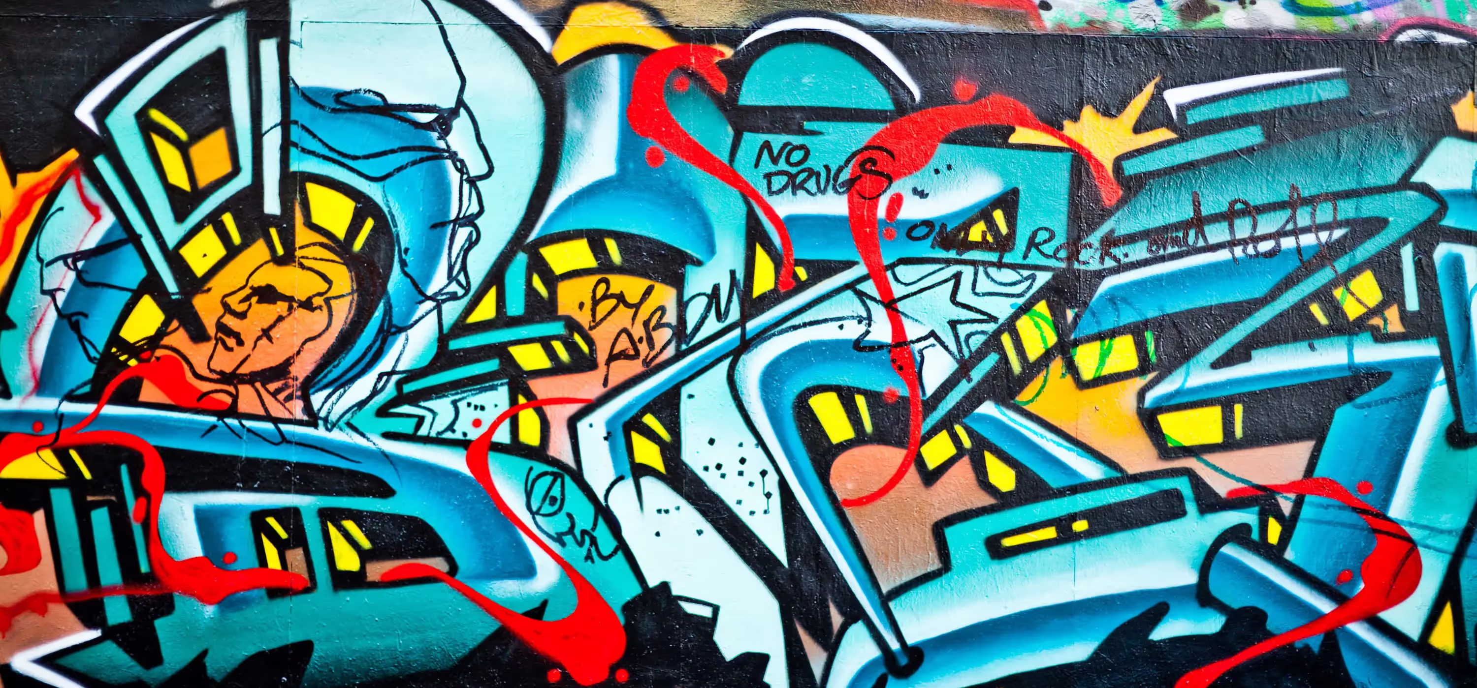
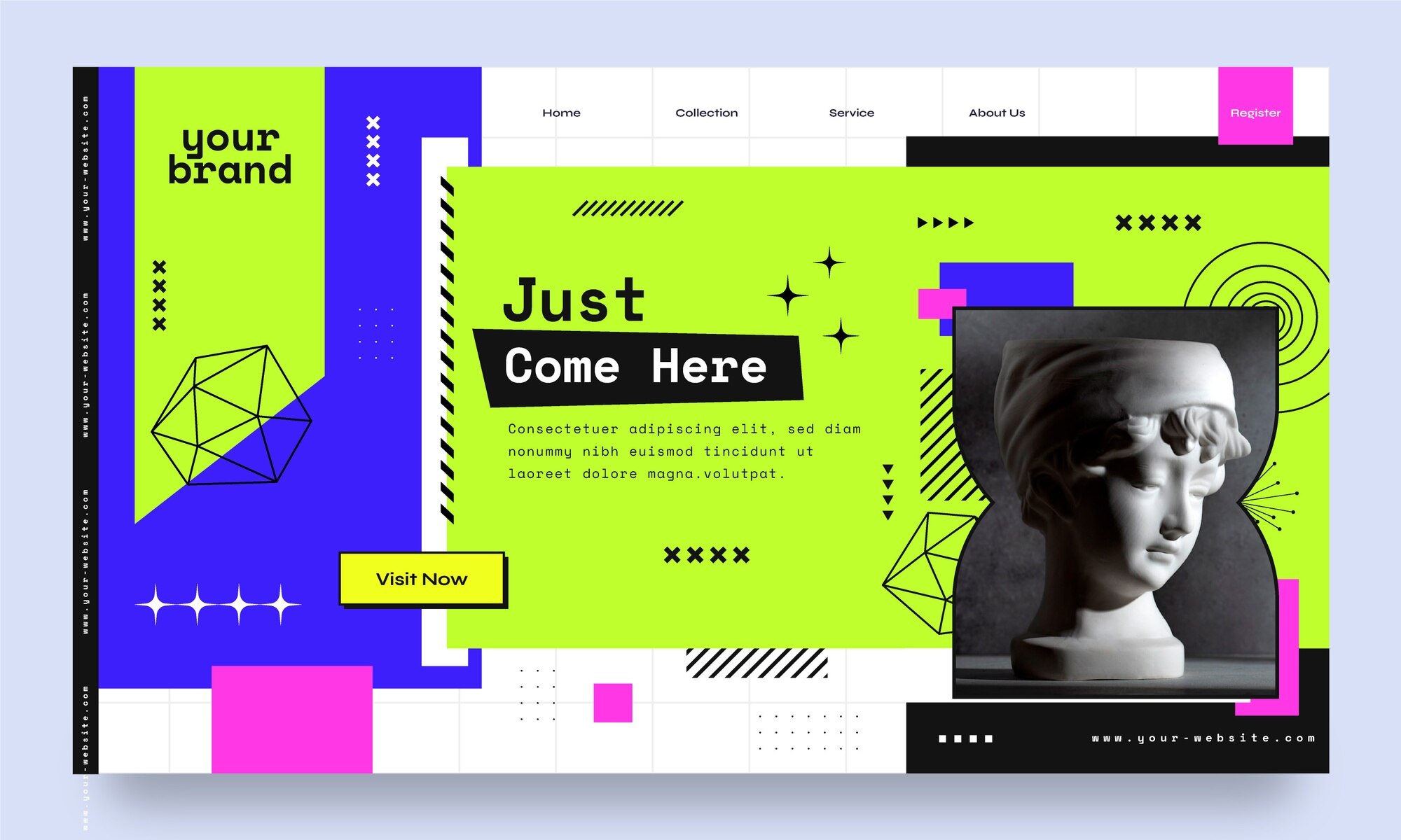
Brutalismul este un stil raw, experimental care respinge normele estetice tradiționale în favoarea unei tipografii îndrăzețe, contrastelor de culoare dure, aspectelor nepolițate și structurilor de design neconvenționale. Adesea vizual dezarmant, adopta o abordare anti-design care prioritizează funcția în detrimentul formei. Inspirat inițial de arhitectura brutalistă, acest stil web atrage audiente de nișă, cum ar fi comunități artistice, branduri underground și proiecte web experimentale care doresc să se evidențieze într-o mulțime de site-uri corporate polițate. Site-urile brutalist cuprind frecvent fonturi monospace, aspecte asimetrice și styling minimal, evocând adesea o estetică raw, DIY care reflectă o revoltă împotriva principiilor convenționale ale design-ului web. Acest stil, deși nu este pentru toată lumea, creează o experiență web unică, autentică și neconvențională.
Neumorfism
Neumorphismul (sau noul skeuomorphism) este o tendință modernă de UI care îmbină design-ul plat cu umbre moi și realiste pentru a crea un efect subtil 3D. Această abordare face ca elementele interfeței să pară ușor ridicate sau încorporate, dând butoanelor și componentelor o senzație realistă dar modernă. Neumorphismul se bazează pe contrast scăzut, palete de culori pastel și efecte de iluminare delicate pentru a menține o estetică curată și moale. Deși atrăgător din punct de vedere vizual, necesită ajustări atente ale contrastului pentru accesibilitate și vizibilitate, deoarece un contrast scăzut poate face uneori ca elementele UI să fie greu de distins. Este adesea folosit în design-urile de tablouri de bord, aplicații fintech și interfețe mobile, unde estetici elegante și futuriste îmbunătățesc experiența utilizatorului. Odată cu accentul tot mai mare pus pe accesibilitatea UI, neumorphismul este rafinat pentru a echilibra atractivitatea vizuală cu utilizabilitatea, asigurând o interacțiune generală mai bună.
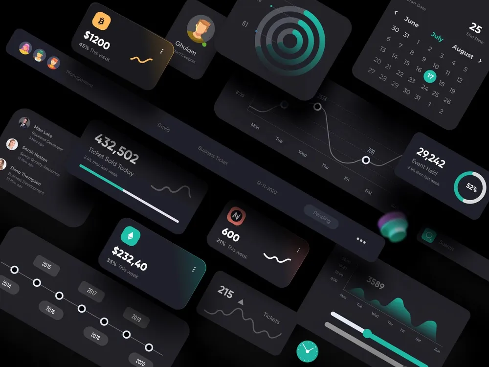
Design în Mod Întunecat
Design-ul în mod întunecat înlocuiește fundalurile albe tradiționale cu teme mai întunecate, reducând oboseala ochilor și îmbunătățind contrastul pentru lizibilitate, în special în mediile cu lumină redusă. Oferă o estetică elegantă și modernă, ajutând totodată la economisirea duratei bateriei pe ecrane OLED și AMOLED, făcând-o o opțiune preferată pentru utilizatorii de dispozitive mobile. Acest stil este adoptat pe scară largă în instrumente de dezvoltare, platforme de socializare și aplicații moderne, în special pentru utilizabilitate nocurnă și experiențe de vizionare imersive. Modul întunecat prezintă adesea scheme de culori cu contrast ridicat, accente neon și elemente UI minimaliste pentru a crea o imagine futuristă și vizual captivantă. Multe site-uri web și aplicații oferă acum opțiuni de comutare pentru a alterna între modul luminos și întunecat, permițând utilizatorilor să aleagă experiența vizuală preferată. Popularitatea sa continuă să crească pe măsură ce mai multe platforme prioritizează confortul utilizatorului, personalizarea și lizibilitatea îmbunătățită.
Design Web Ilustrativ și Artistic
Acest stil încorporează elemente desenate manual, animații personalizate și detalii artistice to create a experiență unică și vizual captivantă. Folosit adesea în portofolii creative, site-uri de povestire și design-uri axate pe branding, design-ul web ilustrativ ajută la transmiterea personalității și originalității, făcând spațiile digitale să se simtă mai organice și expresive. Utilizarea ilustrațiilor personalizate, schițelor animate și tipografiei artistice aduce un simț de unicitate site-urilor web, diferențiindu-le de aspectele generice bazate pe șabloane. Este frecvent adoptat de artiști independenți, studiouri de design și mărci care doresc să-și prezinte creativitatea într-un mod captivant. Prin integrarea elementelor interactive și grafica în mișcare, design-ul web ilustrativ îmbunătățește angajamentul utilizatorului, consolidând totodată identitatea mărcii, făcând experiența mai imersivă și memorabilă.

Design Retro și Vintage
Inspirat de estetici din trecut, design-ul web retro îmbrățișează grafică pixelată, culori bold, tipuri de caractere clasice și elemente UI nostalgice care amintesc de 80s, 90s, or early 2000s web aesthetics. It often incorporates design elements like glitch effects, neon lights, VHS-style overlays, and old-school typography to evoke nostalgia. Many brands, especially those in the gaming, fashion, and entertainment industries, use this style to create a sense of familiarity and fun for users who have fond memories of earlier digital trends. Retro design is commonly found in gaming websites, digital art projects, and creative agency pages, where designers want to mix nostalgia with modern functionality. While visually engaging, this style must balance nostalgia with usability, ensuring that the experience remains intuitive, responsive, and engaging for contemporary audiences.
Viitorul stilurilor de design web
Pe măsură ce tehnologia evoluează, stilurile de design web continuă să se schimbe, integrând personalizare condusă de AI, elemente 3D imersive și estetici futuriste. În timp ce unele stiluri rămân intemporale (minimalism, dark mode), altele evoluează pentru a reflecta comportamentele moderne ale utilizatorilor și tendințele digitale. Ascensiunea instrumentelor de design alimentate de AI, Web3 și interfețele AR/VR vor introduce probabil stiluri noi axate pe experiențe de utilizator adaptive și inteligente. Design-ul web de succes echilibrează estetica cu utilizabilitatea, performanța și accesibilitatea, asigurând o călătorie digitală fără probleme pe toate dispozitivele. Pe măsură ce designerii continuă să inoveze, design-ul web va deveni mai interactiv, mai incluziv și mai imersiv, modelând experiențele digitale ale viitorului.
Concluzie - Designul web este un fuziune dinamică a creativității și tehnologiei, modelând modul în care utilizatorii interacționează cu lumea digitală. Necesită un echilibru între atractivitate estetică, experiență utilizator și optimizare a performanței pentru a asigura o platformă captivantă, accesibilă și funcțională. Pe măsură ce tehnologia evoluează, web design-ul continuă să depășească limitele, integrând noi tendințe, instrumente și filozofii pentru a redefinii experiența digitală.
Exemplu reprezentativ


Simona Niță
Copywriter
O povestitoare pasionată care iubește transformarea ideilor în cuvinte. Când nu scriu, mă vei găsi explorând, ascultând muzică sau visând la următoarea aventură.