A tipografia é a arte de organizar letras e textos para aprimorar a legibilidade e o apelo estético. De antigas escritas manuscritas a tipos digitais, ela desempenhou um papel crucial na comunicação, branding e design visual. Combinando função com criatividade, a tipografia influencia tudo, desde livros e publicidade até interfaces de usuário e mídias digitais.
O design de fontes combina estética e funcionalidade para criar caracteres que não são apenas legíveis, mas também expressivos. De linhas finas e cursivas a formas ousadas e geométricas, as fontes são projetadas para dar às mensagens um tom distinto, apropriado para cada contexto visual. Esta disciplina exige atenção minuciosa aos detalhes, proporção e ao equilíbrio entre os elementos individuais de cada letra.

História
A história do design de fontes é vasta, começando na antiguidade, mas realmente revolucionada com a invenção da tipografia móvel por Johannes Gutenberg em 1440. Essa inovação permitiu a impressão rápida e eficiente de textos, e a fonte gótica Textura, usada na primeira Bíblia impressa, tornou‑se o símbolo desse período. O estilo gótico, com suas linhas rígidas e ângulos agudos, dominou a tipografia medieval, refletindo a estética e os valores culturais da época.
"Tipografia é a linguagem que conecta o mundo visual ao mundo literário." - Erik Spiekermann
O Renascimento trouxe uma mudança significativa no design de tipos, marcando a transição dos estilos Góticos para aqueles inspirados nas inscrições clássicas romanas. Durante este período, tipógrafos como Nicolas Jenson introduziram as fontes romanas, caracterizadas por formas mais arredondadas e linhas mais fluidas, que trouxeram nova clareza e elegância ao texto impresso. Aldus Manutius também criou as fontes itálicas, estilos cursivos que economizavam espaço e ofereciam uma estética refinada, tornando-se populares na impressão de pequenos livros.
O século XVIII foi definido pela evolução de transitional and neoclassical styles , in which typographers such as John Baskerville and Giambattista Bodoni experimented with the contrast between thick and thin lines. These fonts brought a geometric elegance to typography, strongly influencing typographic and editorial design of the time. In the 19th century, the Industrial Revolution created an increased demand for large, visible fonts, suitable for advertising and posters. Thus, the first sans-serif fonts appeared , such as Akzidenz Grotesk , seguido depois pelo icônico Helvetica , que redefiniu a modernidade no design gráfico.
"Uma fonte nunca é apenas um conjunto de letras, mas uma interpretação visual do que as palavras significam." - Matthew Carter
Com o advento do século XXI, a revolução digital alterou radicalmente o design de fontes. Softwares como FontLab e Glyphs permitiram aos designers criar fontes personalizadas com uma flexibilidade sem precedentes, abrindo novas possibilidades para a experimentação. Hoje, as fontes adaptativas, criadas especificamente para plataformas web e dispositivos móveis, refletem a necessidade de legibilidade e acessibilidade em ambientes digitais. O design tipográfico moderno não é mais apenas uma questão de funcionalidade, mas uma expressão artística, refletindo o estilo e a identidade visual de marcas e produtos.

Artistas Consagrados
Um dos mais importantes designers de tipografia é Claude Garamond , que viveu no século XVI. Ele criou a famosa Garamond typeface , a Roman typeface that became the standard for elegance and legibility throughout Europe. Garamond was influenced by Italian humanist writing and created a harmonious typeface with flowing lines and balanced proportions. The Garamond typeface remains extremely popular even today, being widely used in book and editorial printing due to its clarity and timeless beauty.

Outro artista notável é Giambattista Bodoni , um tipógrafo italiano do século XVIII que criou a famosa Bodoni typeface . This is a classic example of the neoclassical style , characterized by the strong contrast between thick and thin lines, as well as the geometric and precise shapes of the letters. Bodoni redefined typographic elegance, and his typeface is often used in editorial design and branding to add sophistication and modernity. His work has had a decisive influence on the evolution of modern typography.

John Baskerville é outro nome proeminente no design de tipografia, mais conhecido por criar a Baskerville fonte no século XVIII. Esta transitional typeface marked a shift between the old Roman and modern styles, combining exceptional clarity with sophisticated design. Baskerville was recognized for his obsessive attention to detail and the way he experimented with paper and ink to achieve unprecedented print quality. The Baskerville typeface continues to be widely used due to its balance of elegance and functionality.

No século XX, um dos designers de tipografia mais influentes foi Eric Gill , que criou a famosa Gill Sanstypeface . It became a symbol of British modernism, appreciated for its clean lines and versatility. Gill Sans is a sans-serif typeface that managed to maintain a harmony between the sobriety of geometric shapes and a subtle elegance of lines, being widely used in signage, posters and branding. Its simple yet sophisticated design reflects the influences of the decorative arts and modernism.

Outro nome significativo do século XX é Adrian Frutiger , o criador da fonte Univers . Frutiger created one of the first fonts to be developed in a full range of weights and widths, thus being a precursor to modern adaptive fonts. Univers became extremely popular in corporate design and signage systems, due to its clarity and flexibility. Frutiger continued to influence typographic design with other notable creations, such as the Frutigerfonte , que é usada em aeroportos e sistemas de navegação devido à sua legibilidade impecável.

Na era digital, outro designer renomado é Matthew Carter , que criou a Georgia fonte , uma das fontes mais utilizadas no design para web. Carter é conhecido por sua capacidade de combinar a estética clássica da tipografia com as necessidades específicas dos meios digitais. Georgia was created to provide optimal readability on screens, without sacrificing the beauty of typographic design. His work has had a significant impact on how fonts are perceived and used in the digital age.

O processo de trabalho
The process of working in font design is a deeply creative and technical one, combining artistic craftsmanship with mathematical precision. It all begins with a conceitualização of the font style, a crucial step in which the designer defines the personality and functionality of the letters. This stage involves extensive research into historical styles, understanding contemporary needs, and visualizing the ultimate purpose of the font, whether it is for book text, branding, or digital use. Designers may sketch the first letters by hand to experiment with shapes and proportions.

Depois que o conceito é estabelecido, a criação real das letras follows . This process is done digitally, using specialized programs such as FontLab , Glyphs or RoboFont , which allow each letter to be drawn with extreme precision. Designers adjust lines, curves and angles to create a coherent and harmonious character set. Each letter is carefully constructed to aesthetically match the others, and details such as line thickness, contrast and proportions are adjusted to create the perfect balance between elegance and functionality.

Um aspecto importante do processo é kerning e espaçamento , which refers to how letters are placed next to each other in a text. The designer must manually adjust the distance between characters to ensure optimal readability and a pleasing aesthetic. This is one of the most difficult and delicate stages, as any variation in spacing can affect the entire perception of the font. Designers must test the font in different combinations of letters and words to ensure that the overall appearance remains consistent and harmonious.
"Existem regras universais na tipografia, mas às vezes os melhores resultados surgem quando você as ignora." - David Carson
Finalmente, a fonte passa pela fase de teste e otimização. Isso envolve verificar o comportamento da fonte em diferentes tamanhos, mídias e formatos, como impressão ou uso em telas digitais. Os designers garantem que a fonte seja legível e consistente em qualquer escala e que atenda às necessidades técnicas dos usuários. Durante esta fase, a fonte pode passar por ajustes finos antes de ser distribuída ou implementada em projetos comerciais. Este processo rigoroso garante que cada fonte criada combine estética, funcionalidade e inovação.

Materiais e Ferramentas
Os materiais e ferramentas utilizados no design de tipos são tanto tradicionais quanto digitais, cada um desempenhando um papel vital na criação de fontes notáveis. No passado, o design de fontes começou com esboços desenhados à mão em papel, onde cada letra era meticulosamente desenhada usando lápis, canetas e réguas. Essa abordagem clássica permitiu aos designers explorar as formas e proporções das letras de maneira orgânica, antes de serem transformadas em fontes através de técnicas tradicionais de gravação ou impressão de tipos móveis.
Hoje em dia, as ferramentas digitais transformaram completamente o processo, oferecendo precisão e flexibilidade sem precedentes. Programas como FontLab , Glyphs , e RoboFont allow designers to create and tweak vector fonts at a microscopic level, controlling every detail of the letters—from curves and angles to line thickness and spacing. These tools also offer the ability to optimize fonts for various platforms, from print to digital use, ensuring that fonts remain legible and aesthetically pleasing in any context. Although the digital environment dominates today, the fundamental principles of proportion, balance, and harmony remain the same, and modern tools make it easy to translate these ideas into exceptional typographic creations.

Técnicas de trabalho
Font design techniques are essential procedures for creating balanced and functional typefaces. A basic technique is desenho vetorial , used to create the outlines of letters using Bézier curves. This method allows precise control over each line and angle, ensuring that letters have fluid shapes and accurate proportions. In digital design, Bézier curves are fundamental to ensuring that letters fit together perfectly and can be scaled without losing clarity.

Outra técnica essencial é espaçamento e kerning , which involves adjusting the distance between characters to ensure a balanced appearance and optimal readability. Kerning refers to adjusting the distance between specific pairs of letters, while overall spacing, also known as tracking , changes the distance between all characters in a word or text. These subtle adjustments are crucial for text to have a natural visual flow and to avoid uneven spaces that can distract the reader.
Hinting também desempenha um papel importante na garantia da legibilidade da fonte em diferentes tamanhos e resoluções de tela. Hinting é o processo de ajustar pontos críticos nas letras para alinhá-los aos pixels da tela. Este método otimiza a clareza das letras em tamanhos pequenos, especialmente em telas digitais, e ajuda a manter a integridade visual da fonte em diferentes ambientes.

Uma técnica avançada usada por designers tipográficos é interpolation . This involves creating multiple font weights and styles from an initial set of letters. By interpolation, designers can create fonts that have a smooth transition from a thin style to a bold one, while maintaining the consistency of the letter shapes. This technique is extremely efficient, saving time and ensuring stylistic consistency across the entire font family.
Ambiente Integrado
O design de fontes opera em um ambiente integrado that combines art, technology and visual communications. It is closely related to other creative fields, such as graphic design, advertising and digital media, where fonts play a key role in conveying messages. In the digital age, fonts must be adaptable and flexible, as they are used across a wide variety of platforms, from print to web and mobile devices. The seamless integration of fonts across various media is essential to ensure a experiência visual coerente e agradável , independentemente do tamanho ou contexto em que são usadas.
Enquadramento Multicultural
Fonts are not only aesthetic forms, but also cultural vehicles that reflect and influence the visual identities of different nations and social groups. In a cenário multicultural , os designers de fontes devem estar cientes dos significados culturais e simbólicos das formas e estilos tipográficos. Em diferentes culturas, certos caracteres ou formas de letras podem ter conotações distintas, variando de elegância e tradição a modernidade e rebeldia. A globalização e a interação entre culturas diversas levaram a um aumento na demanda por fontes que sejam fáceis de entender e usar em múltiplos idiomas e contextos culturais, sem perder sua especificidade e relevância locais.
Contexto Social
From a social perspective, font design has a considerable impact on comunicação pública e privada . Typography influences the way people perceive and understand written messages, and fonts play a central role in shaping the visual identities of brands, products, and social awareness campaigns. For example, fonts used in advertising campaigns can stimulate strong emotional reactions, and those used in educational projects can contribute to the accessibility and understanding of written materials. In addition, fonts play an important role in accessibility, contributing to the creation of texts that are easier to read and understand for people with visual disabilities, through fonts specially created for this purpose.
Contexto Profissional
From a professional perspective, font design is a competitive and ever-changing field that requires a combinação de habilidades artísticas e técnicas . Typographic designers must not only be creative, but also possess a deep understanding of design software and market needs. They also frequently collaborate with graphic designers, advertising agencies, and international brands, adapting fonts to the specific requirements of clients and projects. In the digital age, typographic design professionals must be able to create fonts that work seamlessly across multiple platforms and in diverse visual contexts, from traditional print to interactive digital interfaces. Ethical responsibility is also an important part of the profession, as fonts can subtly influence audience behaviors and perceptions.
Estilos
Os estilos no design de fontes representam uma combinação harmoniosa de expressão visual e funcionalidade textual, refletindo tanto épocas históricas quanto desenvolvimentos culturais e tecnológicos. Ao longo do tempo, diversos estilos tipográficos foram criados para atender às necessidades estéticas e práticas da sociedade, cada um com suas características únicas.
Estilo Romano
Um dos estilos mais antigos e influentes é o estilo romano , which emerged during the Renaissance and is characterized by clear, well-proportioned letters inspired by classical Roman inscriptions. Roman fonts, such as those created by Nicolas Jenson or Aldus Manutius, introduced superior legibility and a timeless elegance to typography. They are widely used in print and publishing, due to their visual clarity and ability to adapt to various sizes and formats.

Estilo Gótico
Outro estilo importante é o Gótico or blackletter style , which dominated medieval Europe and is characterized by angular, dense, and ornate letters. Commonly used in manuscripts and early printed books, such as the Gutenberg Bible, this style suggests authority and tradition. Although no longer widely used in current text, blackletter is still found in titles and logos, where a reference to history or a distinct aesthetic is desired.

Estilo Serif
Another style that has brought about a significant change is o estilo serif . Serif fonts are defined by the fine lines that decorate the ends of the letters, giving a formal and well-structured appearance. Famous fonts such as Times New Roman and Garamond são exemplos clássicos de serifa, sendo comumente usados em livros, jornais e revistas porque oferecem excelente legibilidade no papel. A serifa, com sua precisão e equilíbrio, sugere tradição e refinamento.

Estilo Sans-Serif
Por outro lado, o estilo sans-serif represents a stark contrast, characterized by the absence of these ornaments. Styles such as Helvetica , Futura and Arial se destaca por formas simples, claras e minimalistas, frequentemente associadas à modernidade e ao design funcional. Esse estilo é extremamente popular no ambiente digital e na publicidade contemporânea devido à sua versatilidade e capacidade de permanecer legível em tamanhos pequenos, tanto em telas quanto em impressão.

Estilo Script
Adicionalmente, o estilo script oferece uma estética completamente diferente, inspirada na caligrafia. As fontes script, como Brush Script ou Zapfino, são cursivas, com um fluxo natural de letras, o que confere um toque de elegância e fluidez. Estas fontes são frequentemente utilizadas em design de convites, branding e publicidade quando se deseja uma atmosfera sofisticada e personalizada.

O Estilo Slab Serif
Outro estilo importante na tipografia é o estilo serif , a combination of the tradition of serif and the functionality of sans-serif. Serif fonts, such as Rockwell and Courier , are distinguished by their thick, uniform lines and straight corners, providing clear readability and a strong visual impact. They are frequently used in editorial design and headlines, where a strong, clear visual presence is desired.

Estilo Geométrico
Estilos geométricos são outro ramo do design tipográfico, inspirado em formas geométricas puras. Fontes como Futura use circles, squares, and triangles to create precise, well-defined characters that convey a sense of order and stability. These styles are associated with modernism and are often used in contemporary graphic design, especially in branding and posters.

O design de fontes é uma síntese sutil entre estética e funcionalidade, oferecendo uma linguagem visual através da qual as letras se tornam mais do que simples símbolos – tornam-se expressões de identidade e comunicação. Na sua evolução, desde as inscrições clássicas às fontes digitais modernas, o design de fontes demonstrou a capacidade de moldar perceções, transmitir emoções e influenciar as formas como interagimos com o texto. A criatividade tipográfica é essencial não só para a clareza da mensagem, mas também para o enriquecimento da experiência visual, refletindo a diversidade cultural e as inovações tecnológicas de cada era.
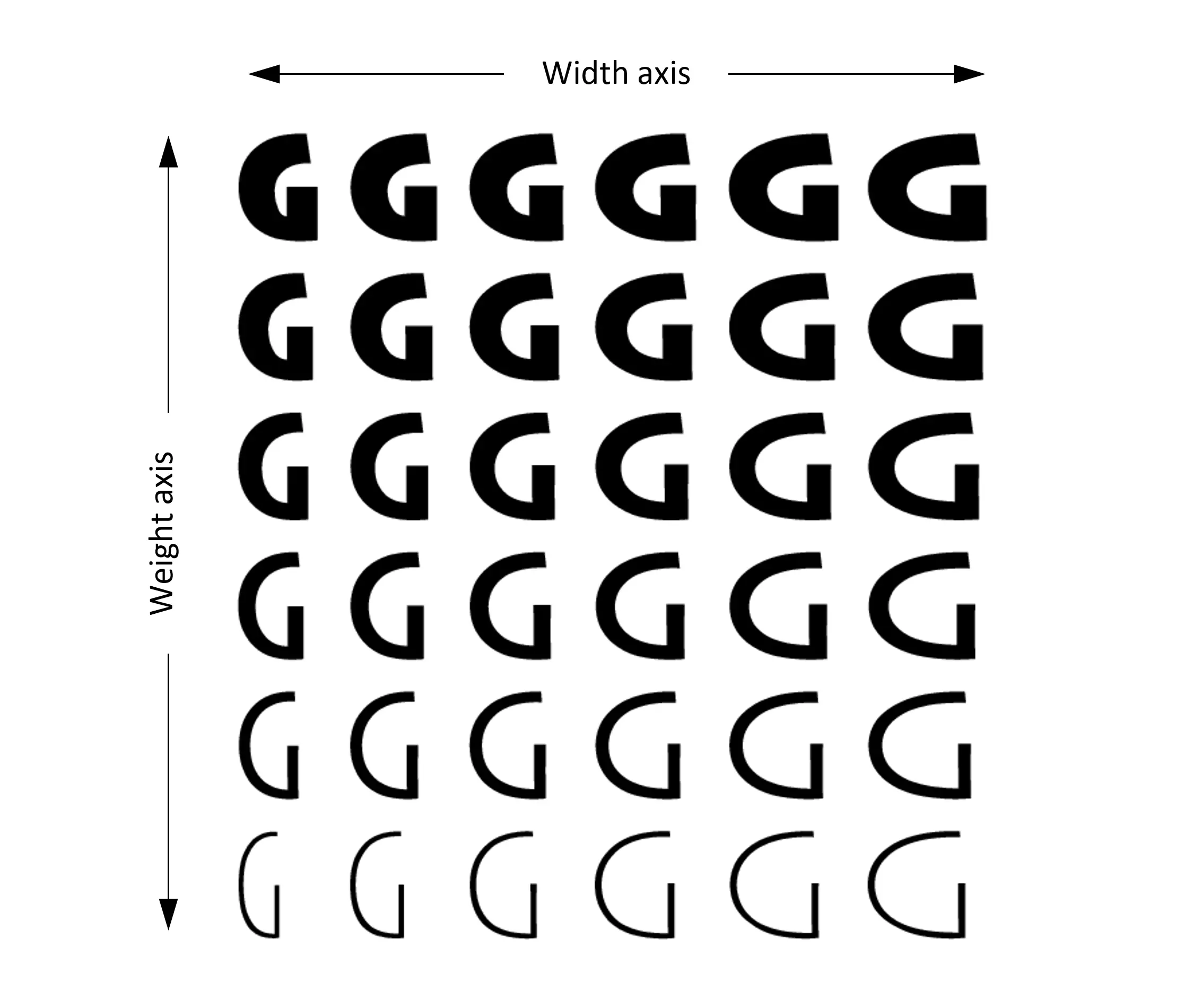
Visual Examples


Monica Briciu
Redatora Publicitária
Quando escrevo, estou totalmente imersa — apaixonada, focada e no meu fluxo criativo. Quando não estou, provavelmente me encontrará cantarolando minhas músicas favoritas, desfrutando de uma longa caminhada ou perdida em um bom livro.