Typography is the art of arranging letters and text to enhance readability and aesthetic appeal. From ancient handwritten scripts to digital typefaces, it has played a crucial role in communication, branding, and visual design. Blending function with creativity, typography influences everything from books and advertising to user interfaces and digital media.
Font design combines aesthetics and functionality to create characters that are not only legible but also expressive. From fine, cursive lines to bold, geometric shapes, fonts are designed to give messages a distinctive tone, appropriate for each visual context. This discipline requires close attention to detail, proportion, and the balance between the individual elements of each letter.

History
The history of font design is vast, beginning in antiquity, but truly revolutionized with the invention of movable type by Johannes Gutenberg in 1440. This innovation allowed for the rapid and efficient printing of texts, and the Gothic font Textura, used in the first printed Bible, became the symbol of this period. The Gothic style, with its rigid lines and sharp angles, dominated medieval typography, reflecting the aesthetics and cultural values of the era.
"Typography is the language that connects the visual world to the literary world." - Erik Spiekermann
The Renaissance brought a significant change in typeface design, marking the transition from Gothic styles to those inspired by classical Roman inscriptions. During this period, typographers such as Nicolas Jenson introduced Roman fonts, characterized by rounder shapes and more fluid lines, which brought a new clarity and elegance to printed text. Aldus Manutius also created italic fonts, cursive styles that saved space and offered a refined aesthetic, becoming popular in the printing of small books.
The 18th century was defined by the evolution of transitional and neoclassical styles , in which typographers such as John Baskerville and Giambattista Bodoni experimented with the contrast between thick and thin lines. These fonts brought a geometric elegance to typography, strongly influencing typographic and editorial design of the time. In the 19th century, the Industrial Revolution created an increased demand for large, visible fonts, suitable for advertising and posters. Thus, the first sans-serif fonts appeared , such as Akzidenz Grotesk , followed later by the iconic Helvetica , which redefined modernity in graphic design.
"A font is never just a set of letters, but a visual interpretation of what the words mean." - Matthew Carter
With the advent of the 21st century, the digital revolution has radically changed font design. Software such as FontLaband Glyphs have allowed designers to create custom fonts with unprecedented flexibility, opening up new possibilities for experimentation. Today, adaptive fonts, created specifically for web platforms and mobile devices, reflect the need for readability and accessibility in digital environments. Modern typographic design is no longer just a matter of functionality, but an artistic expression, reflecting the style and visual identity of brands and products.

Consecrated Artists
One of the most important typeface designers is Claude Garamond , who lived in the 16th century. He created the famous Garamond typeface , a Roman typeface that became the standard for elegance and legibility throughout Europe. Garamond was influenced by Italian humanist writing and created a harmonious typeface with flowing lines and balanced proportions. The Garamond typeface remains extremely popular even today, being widely used in book and editorial printing due to its clarity and timeless beauty.

Another notable artist is Giambattista Bodoni , an 18th-century Italian typographer who created the famous Bodoni typeface . This is a classic example of the neoclassical style , characterized by the strong contrast between thick and thin lines, as well as the geometric and precise shapes of the letters. Bodoni redefined typographic elegance, and his typeface is often used in editorial design and branding to add sophistication and modernity. His work has had a decisive influence on the evolution of modern typography.

John Baskerville is another prominent name in typeface design, best known for creating the Baskerville typeface in the 18th century. This transitional typeface marked a shift between the old Roman and modern styles, combining exceptional clarity with sophisticated design. Baskerville was recognized for his obsessive attention to detail and the way he experimented with paper and ink to achieve unprecedented print quality. The Baskerville typeface continues to be widely used due to its balance of elegance and functionality.

In the 20th century, one of the most influential typeface designers was Eric Gill , who created the famous Gill Sanstypeface . It became a symbol of British modernism, appreciated for its clean lines and versatility. Gill Sans is a sans-serif typeface that managed to maintain a harmony between the sobriety of geometric shapes and a subtle elegance of lines, being widely used in signage, posters and branding. Its simple yet sophisticated design reflects the influences of the decorative arts and modernism.

Another significant name from the 20th century is Adrian Frutiger , the creator of the font Univers . Frutiger created one of the first fonts to be developed in a full range of weights and widths, thus being a precursor to modern adaptive fonts. Univers became extremely popular in corporate design and signage systems, due to its clarity and flexibility. Frutiger continued to influence typographic design with other notable creations, such as the Frutigerfont , which is used in airports and navigation systems due to its impeccable legibility.

In the digital age, another renowned designer is Matthew Carter , who created the Georgia font , one of the most widely used fonts for web design. Carter is known for his ability to blend the classic aesthetics of typography with the specific needs of digital media. Georgia was created to provide optimal readability on screens, without sacrificing the beauty of typographic design. His work has had a significant impact on how fonts are perceived and used in the digital age.

The work process
The process of working in font design is a deeply creative and technical one, combining artistic craftsmanship with mathematical precision. It all begins with the conceptualization of the font style, a crucial step in which the designer defines the personality and functionality of the letters. This stage involves extensive research into historical styles, understanding contemporary needs, and visualizing the ultimate purpose of the font, whether it is for book text, branding, or digital use. Designers may sketch the first letters by hand to experiment with shapes and proportions.

After the concept is established, the actual creation of the letters follows . This process is done digitally, using specialized programs such as FontLab , Glyphs or RoboFont , which allow each letter to be drawn with extreme precision. Designers adjust lines, curves and angles to create a coherent and harmonious character set. Each letter is carefully constructed to aesthetically match the others, and details such as line thickness, contrast and proportions are adjusted to create the perfect balance between elegance and functionality.

An important aspect of the process is kerning and spacing , which refers to how letters are placed next to each other in a text. The designer must manually adjust the distance between characters to ensure optimal readability and a pleasing aesthetic. This is one of the most difficult and delicate stages, as any variation in spacing can affect the entire perception of the font. Designers must test the font in different combinations of letters and words to ensure that the overall appearance remains consistent and harmonious.
"There are universal rules in typography, but sometimes the best results come when you ignore them." - David Carson
Finally, the font goes through the testing and optimization stage . This involves checking the font’s behavior in different sizes, media, and formats, such as print or use on digital screens. Designers ensure that the font is legible and consistent at any scale and that it meets the technical needs of users. During this phase, the font may undergo fine-tuning before being distributed or implemented in commercial projects. This rigorous process ensures that each font created combines aesthetics, functionality, and innovation.

Materials and tools
The materials and tools used in type design are both traditional and digital, each playing a vital role in creating remarkable typefaces. In the past, type design began with hand-drawn sketches on paper, where each letter was meticulously drawn using pencils, pens, and rulers. This classic approach allowed designers to explore the shapes and proportions of letters in an organic way, before they were transformed into typefaces using traditional engraving or movable type printing techniques.
Today, digital tools have completely transformed the process, offering unprecedented precision and flexibility. Programs like FontLab , Glyphs , and RoboFont allow designers to create and tweak vector fonts at a microscopic level, controlling every detail of the letters—from curves and angles to line thickness and spacing. These tools also offer the ability to optimize fonts for various platforms, from print to digital use, ensuring that fonts remain legible and aesthetically pleasing in any context. Although the digital environment dominates today, the fundamental principles of proportion, balance, and harmony remain the same, and modern tools make it easy to translate these ideas into exceptional typographic creations.

Working techniques
Font design techniques are essential procedures for creating balanced and functional typefaces. A basic technique is vector drawing , used to create the outlines of letters using Bézier curves. This method allows precise control over each line and angle, ensuring that letters have fluid shapes and accurate proportions. In digital design, Bézier curves are fundamental to ensuring that letters fit together perfectly and can be scaled without losing clarity.

Another essential technique is spacing and kerning , which involves adjusting the distance between characters to ensure a balanced appearance and optimal readability. Kerning refers to adjusting the distance between specific pairs of letters, while overall spacing, also known as tracking , changes the distance between all characters in a word or text. These subtle adjustments are crucial for text to have a natural visual flow and to avoid uneven spaces that can distract the reader.
Hinting also plays an important role in ensuring font readability across screen sizes and resolutions. Hinting is the process of adjusting critical points in letters to align with the screen pixels. This method optimizes the clarity of letters at small sizes, especially on digital screens, and helps maintain the visual integrity of the font across different environments.

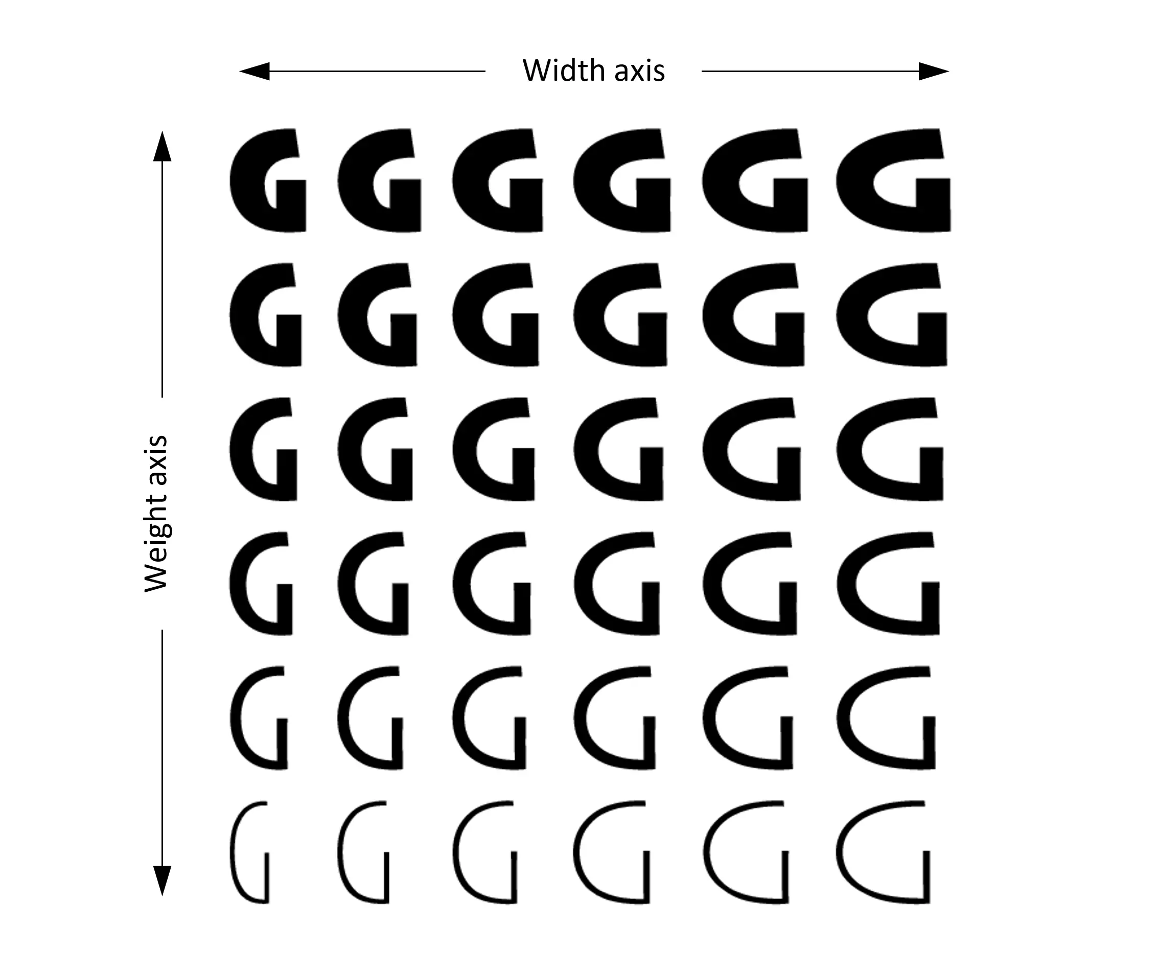
An advanced technique used by typographic designers is interpolation . This involves creating multiple font weights and styles from an initial set of letters. By interpolation, designers can create fonts that have a smooth transition from a thin style to a bold one, while maintaining the consistency of the letter shapes. This technique is extremely efficient, saving time and ensuring stylistic consistency across the entire font family.
Integrated Environment
Font design operates in an integrated environment that combines art, technology and visual communications. It is closely related to other creative fields, such as graphic design, advertising and digital media, where fonts play a key role in conveying messages. In the digital age, fonts must be adaptable and flexible, as they are used across a wide variety of platforms, from print to web and mobile devices. The seamless integration of fonts across various media is essential to ensure a coherent and enjoyable visual experience , regardless of the size or context in which they are used.
Multicultural Framework
Fonts are not only aesthetic forms, but also cultural vehicles that reflect and influence the visual identities of different nations and social groups. In a multicultural setting , font designers must be aware of the cultural and symbolic meanings of typographic forms and styles. In different cultures, certain characters or letterforms can have distinct connotations, ranging from elegance and tradition to modernity and rebellion. Globalization and the interaction between diverse cultures have led to an increase in demand for fonts that are easy to understand and use in multiple languages and cultural contexts, without losing their local specificity and relevance.
Social Context
From a social perspective, font design has a considerable impact on public and private communication . Typography influences the way people perceive and understand written messages, and fonts play a central role in shaping the visual identities of brands, products, and social awareness campaigns. For example, fonts used in advertising campaigns can stimulate strong emotional reactions, and those used in educational projects can contribute to the accessibility and understanding of written materials. In addition, fonts play an important role in accessibility, contributing to the creation of texts that are easier to read and understand for people with visual disabilities, through fonts specially created for this purpose.
Professional Context
From a professional perspective, font design is a competitive and ever-changing field that requires a combination of artistic and technical skills . Typographic designers must not only be creative, but also possess a deep understanding of design software and market needs. They also frequently collaborate with graphic designers, advertising agencies, and international brands, adapting fonts to the specific requirements of clients and projects. In the digital age, typographic design professionals must be able to create fonts that work seamlessly across multiple platforms and in diverse visual contexts, from traditional print to interactive digital interfaces. Ethical responsibility is also an important part of the profession, as fonts can subtly influence audience behaviors and perceptions.
Styles
Styles in font design represent a harmonious combination of visual expression and text functionality, reflecting both historical eras and cultural and technological developments. Over time, various typographic styles have been created to meet the aesthetic and practical needs of society, each with its own unique characteristics.
Roman Style
One of the oldest and most influential styles is the Roman style , which emerged during the Renaissance and is characterized by clear, well-proportioned letters inspired by classical Roman inscriptions. Roman fonts, such as those created by Nicolas Jenson or Aldus Manutius, introduced superior legibility and a timeless elegance to typography. They are widely used in print and publishing, due to their visual clarity and ability to adapt to various sizes and formats.

Gothic Style
Another important style is the Gothic or blackletter style , which dominated medieval Europe and is characterized by angular, dense, and ornate letters. Commonly used in manuscripts and early printed books, such as the Gutenberg Bible, this style suggests authority and tradition. Although no longer widely used in current text, blackletter is still found in titles and logos, where a reference to history or a distinct aesthetic is desired.

Serif Style
Another style that has brought about a significant change is the serif style . Serif fonts are defined by the fine lines that decorate the ends of the letters, giving a formal and well-structured appearance. Famous fonts such as Times New Roman and Garamond are classic examples of serifs, being commonly used in books, newspapers and magazines because they offer excellent readability on paper. The serif, with its precision and balance, suggests tradition and refinement.

Sans-Serif Style
On the other hand, the sans-serif style represents a stark contrast, characterized by the absence of these ornaments. Styles such as Helvetica , Futura and Arial are distinguished by simple, clear and minimalist forms, often associated with modernity and functional design. This style is extremely popular in the digital environment and in contemporary advertising due to its versatility and ability to remain legible at small sizes, both on screens and in print.

Script Style
Additionally, script style offers a completely different aesthetic, inspired by handwriting. Script fonts, such as Brush Script or Zapfino , are cursive, with a natural flow of letters, which brings a touch of elegance and fluidity. These fonts are often used in invitation design, branding, and advertising when a sophisticated and personalized atmosphere is desired.

The Slab Serif Style
Another important style in typography is the serif style , a combination of the tradition of serif and the functionality of sans-serif. Serif fonts, such as Rockwell and Courier , are distinguished by their thick, uniform lines and straight corners, providing clear readability and a strong visual impact. They are frequently used in editorial design and headlines, where a strong, clear visual presence is desired.

Geometric Style
Geometric styles are another branch of typeface design, inspired by pure geometric shapes. Fonts like Futura use circles, squares, and triangles to create precise, well-defined characters that convey a sense of order and stability. These styles are associated with modernism and are often used in contemporary graphic design, especially in branding and posters.

Font design is a subtle synthesis between aesthetics and functionality, offering a visual language through which letters become more than simple symbols – they become expressions of identity and communication. In its evolution, from classic inscriptions to modern digital fonts, font design has demonstrated the ability to shape perceptions, convey emotions and influence the ways in which we interact with text. Typographic creativity is essential not only for the clarity of the message, but also for the enrichment of the visual experience, reflecting the cultural diversity and technological innovations of each era.
Visual Examples


Monica Briciu
Copywritter
When I’m writing, I’m fully immersed—passionate, focused, and in my creative flow. When I’m not, you’ll probably catch me humming to my favorite songs, enjoying a long walk, or lost in a good book.