ルーマニア国際デザイン
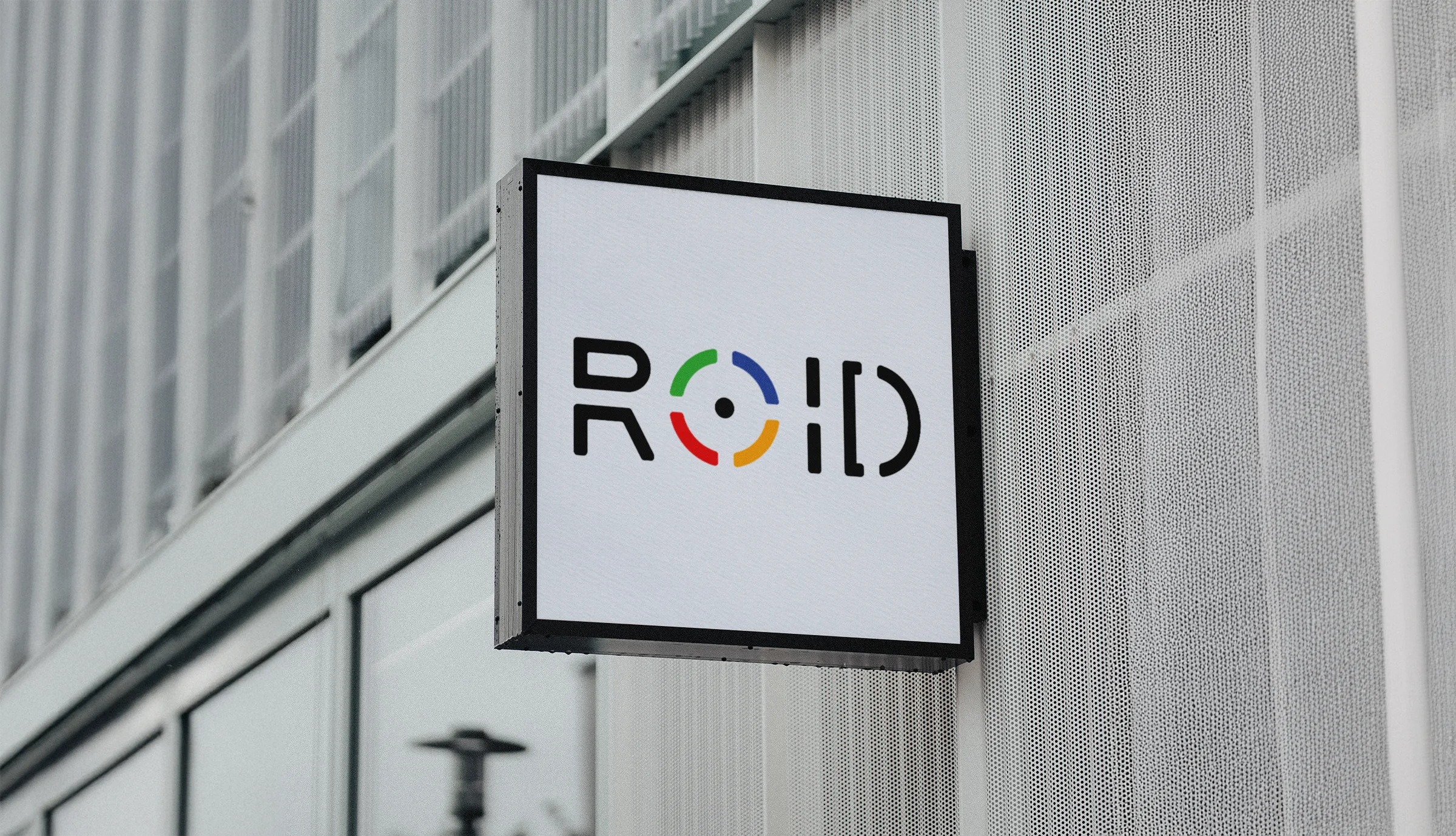
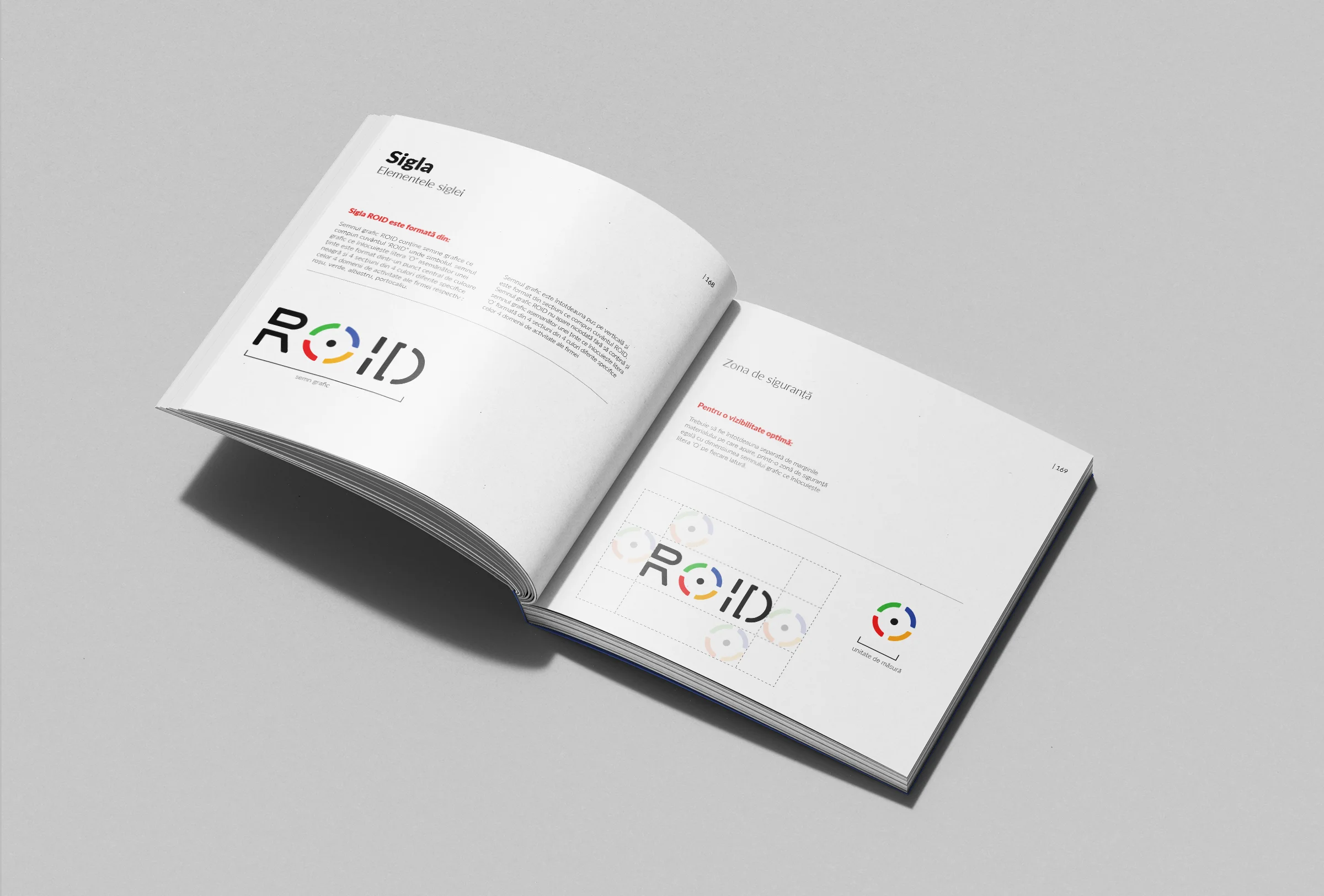
ROIDのブランディングコンセプトは、クリエイティブサービスにおける同社の精度と革新性へのビジョンを体現するように作成されました。アイデンティティの中心となるのはモノグラム「ROID」で、円の神話的な象徴にインスパイアされたセグメント化された「O」が特徴で、太陽、統一、そして集中を象徴しています。このデザインは、品質デザインへの同社のコミットメントを反映しています。
ブランディングプロセスの最初の段階は、ROIDモノグラムを通じたコアビジュアルアイデンティティの創造に焦点を当てました。ロゴの「O」はセグメント化された円としてデザインされ、グラフィックデザイン、プロダクトデザイン、ビデオ制作、2D/3Dグラフィックスとアニメーションという会社の4つの主要なサービス分野を象徴しています。各セグメントにはこれらのサービスを表すユニークな色が割り当てられ、鮮やかでダイナミックな美学が生まれました。
このデザインは、インクルーシビティとコラボレーションを重視し、ROIDの背後にあるクリエイティブコミュニティを反映しています。モノグラムのセグメント化された構造は、提供される多様なサービスをさらに強化し、ミニマリストでありながら大胆なスタイルは、さまざまなプラットフォームやメディアでの適応性を保証します。
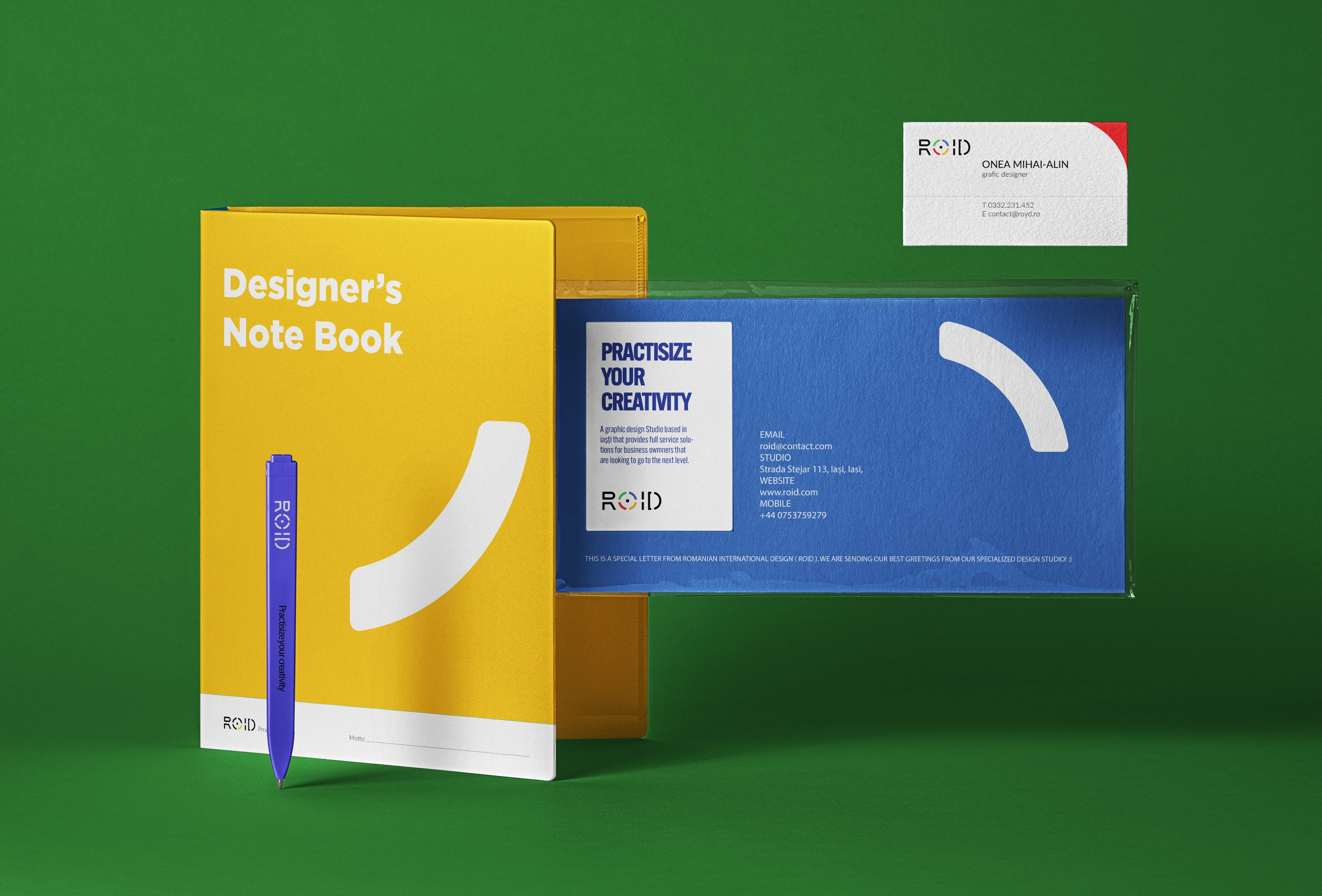
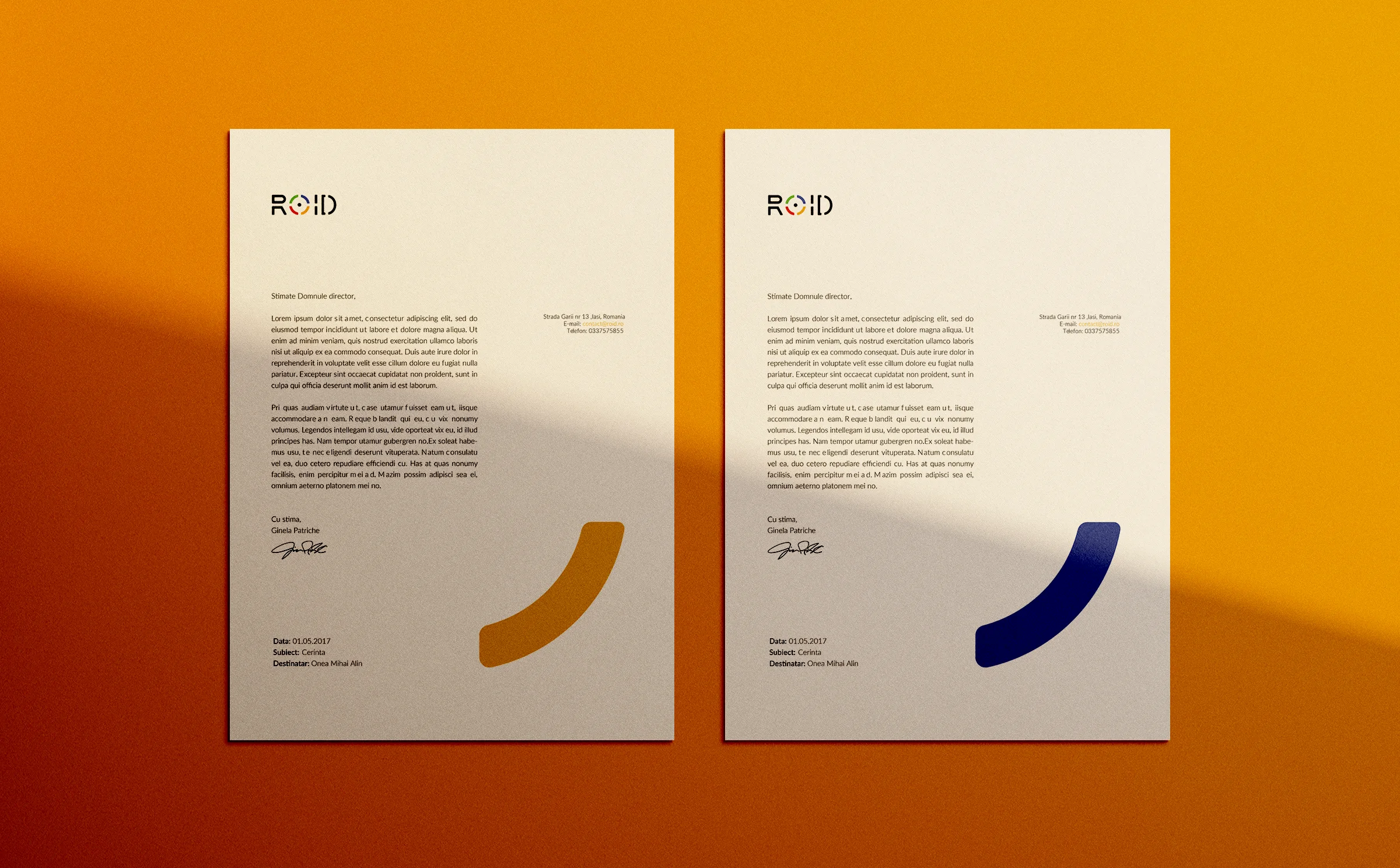
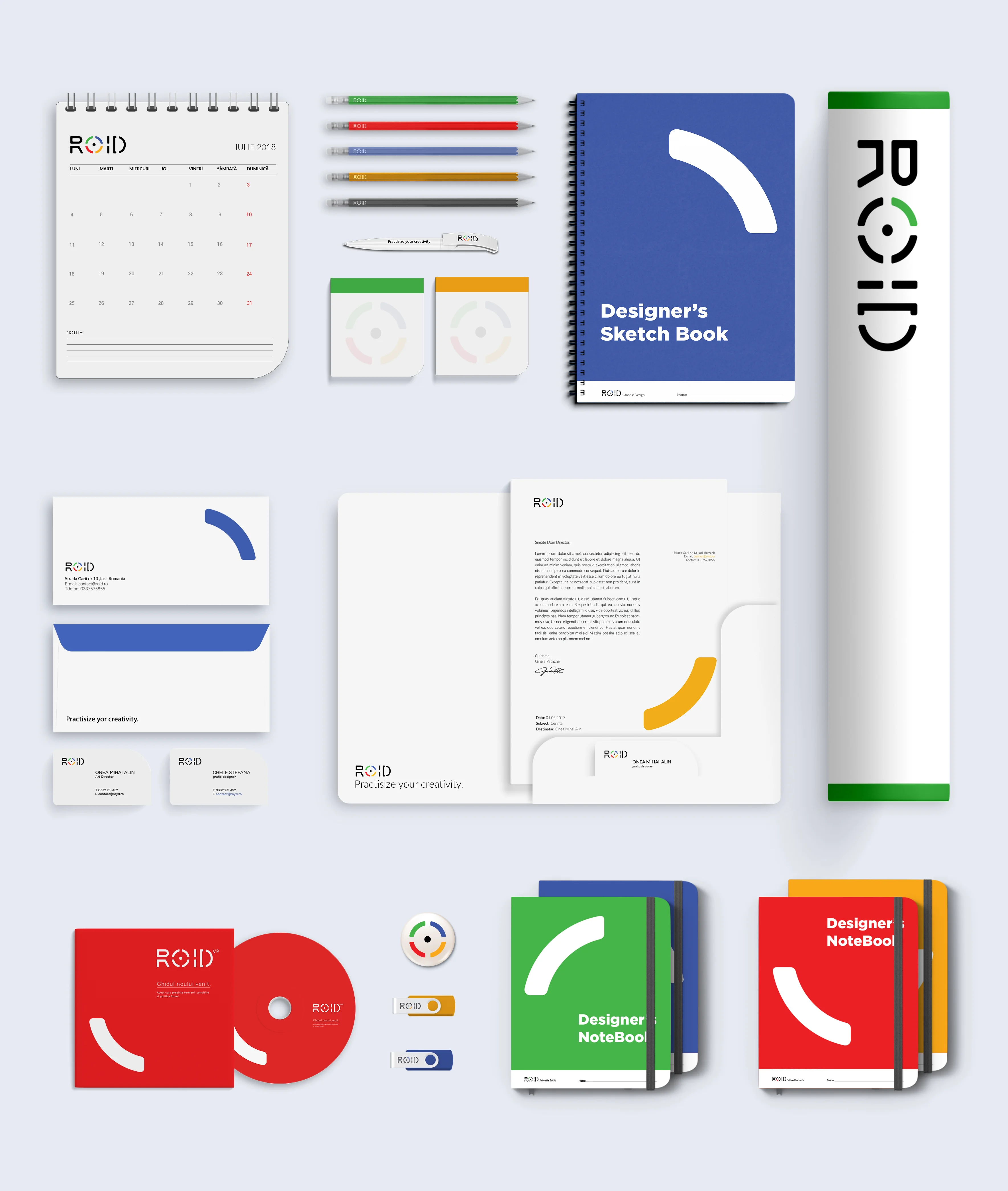
第2段階では、ロゴを補完し、一貫したビジュアルプレゼンスを確立するためのブランド素材一式を開発しました。名刺、レターヘッド、プレゼンテーションテンプレート、プロモーション素材は、ロゴの鮮やかな色彩とセグメント化されたモチーフを使用してデザインされました。これらの素材は、会社のプロフェッショナルなイメージを高めるだけでなく、あらゆるクライアントタッチポイントでのブランド認知を確実にします。
これらの素材における色彩と形状の構造的な使用は、セグメント化されたデザインコンセプトを強化し、実用的なレイアウトは機能性と視覚的な魅力を両立させています。このフェーズでは、クライアントとパートナーのためにシームレスなブランド体験を創造することに焦点を当てました。
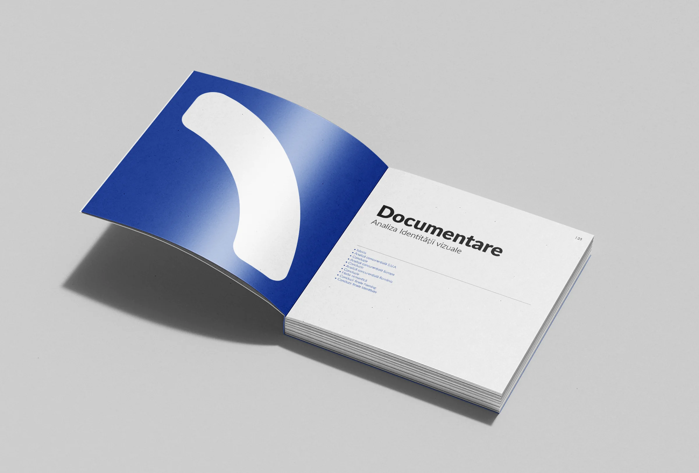
The final stage was the creation of a detailed branding brochure. This document captured the essence of the ROID identity, explaining the inspiration behind the logo, its symbolic elements, and its alignment with the company’s mission. It also included brand guidelines to ensure consistent application across all mediums, detailing rules for logo usage, typography, color schemes, and layout examples.
The brochure also outlined the branding process, showcasing ROID’s approach to design and emphasizing its focus on precision and innovation. This resource serves as both a guide for internal teams and a presentation tool for clients and collaborators.
The ROID branding project successfully established a vibrant and versatile identity that reflects the company’s creative expertise and commitment to quality. From the monogram’s dynamic symbolism to the cohesive brand materials and detailed guidelines, the branding ensures a consistent, professional image across all touchpoints. This strong visual identity positions ROID as a leader in the creative industry, ready to engage with a diverse, global audience.