Design roumain international
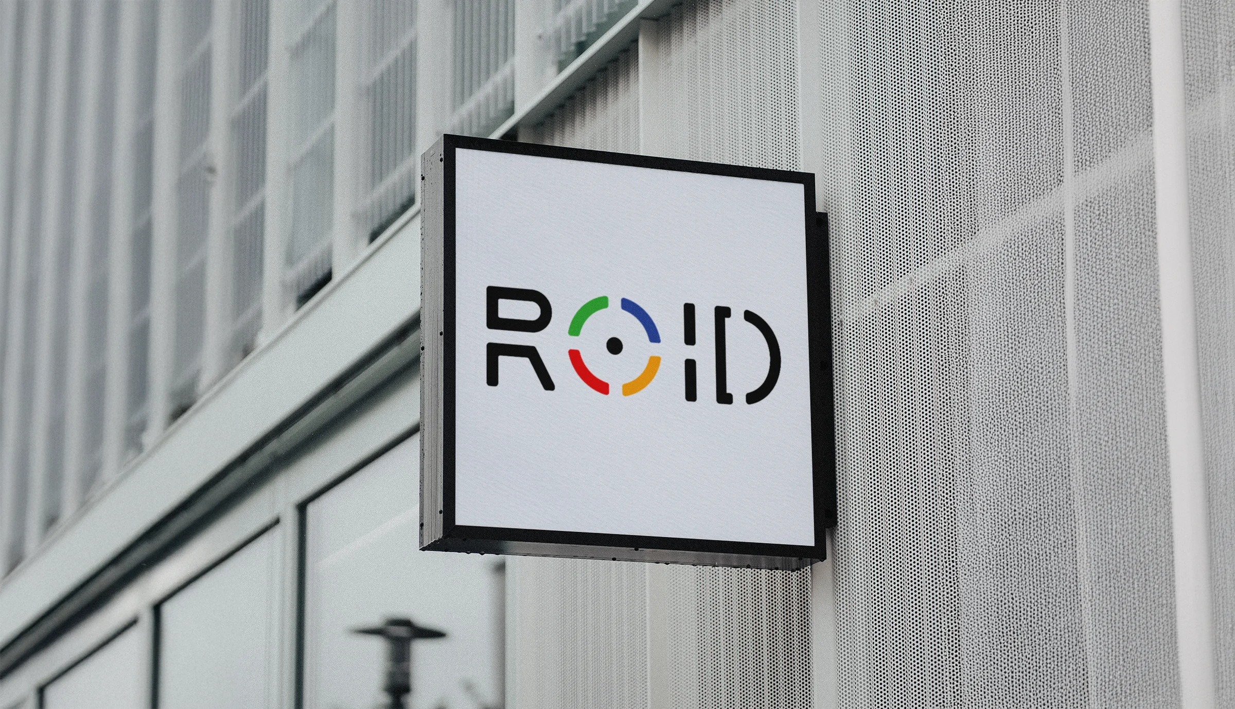
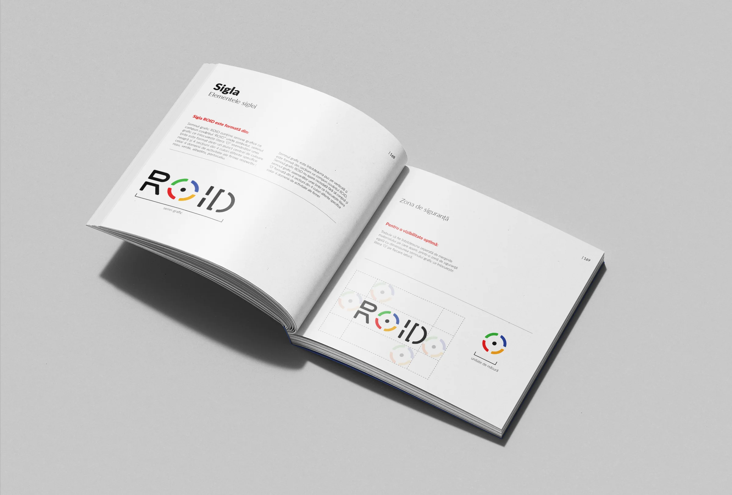
Le concept de marque pour ROID a été conçu pour incarner la vision de l'entreprise en matière de précision et d'innovation dans les services créatifs. Au cœur de l'identité se trouve le monogramme « ROID », présentant un « O » segmenté inspiré du symbolisme mythique du cercle, représentant le soleil, l'unité et la concentration. Le design reflète l'engagement de l'entreprise envers la qualité du design.
La première étape du processus de branding s'est concentrée sur la création de l'identité visuelle centrale à travers le monogramme ROID. Le « O » du logo a été conçu comme un cercle segmenté, symbolisant les quatre domaines clés de services de l'entreprise : design graphique, design de produit, production vidéo et infographie et animation 2D/3D. Chaque segment a reçu une couleur unique représentant ces services, créant une esthétique vibrante et dynamique.
Ce design met l'accent sur l'inclusivité et la collaboration, reflétant la communauté de créatifs derrière ROID. La structure segmentée du monogramme renforce davantage la gamme diversifiée de services proposés, tandis que le style minimaliste mais audacieux assure l'adaptabilité sur diverses plateformes et médias.
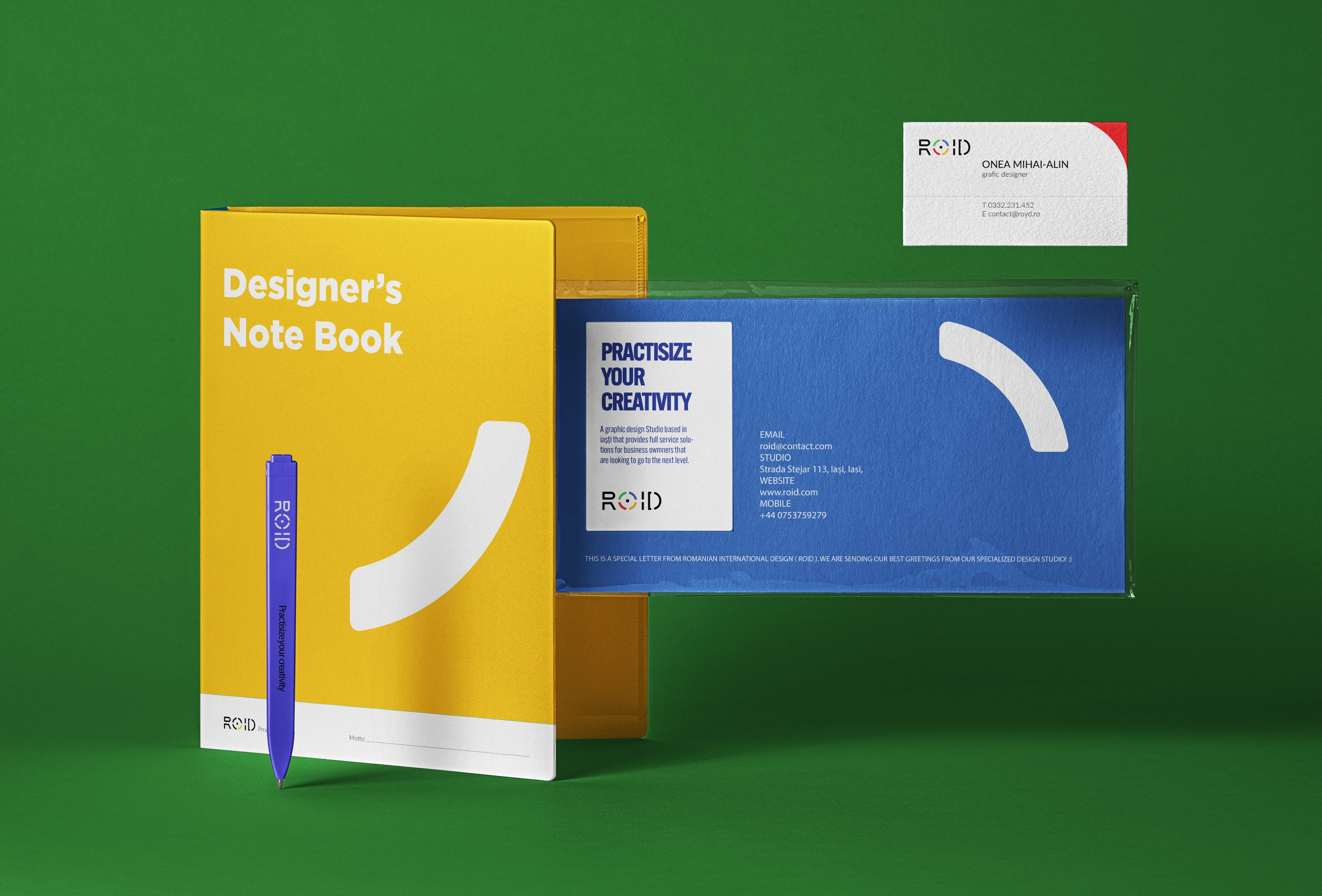
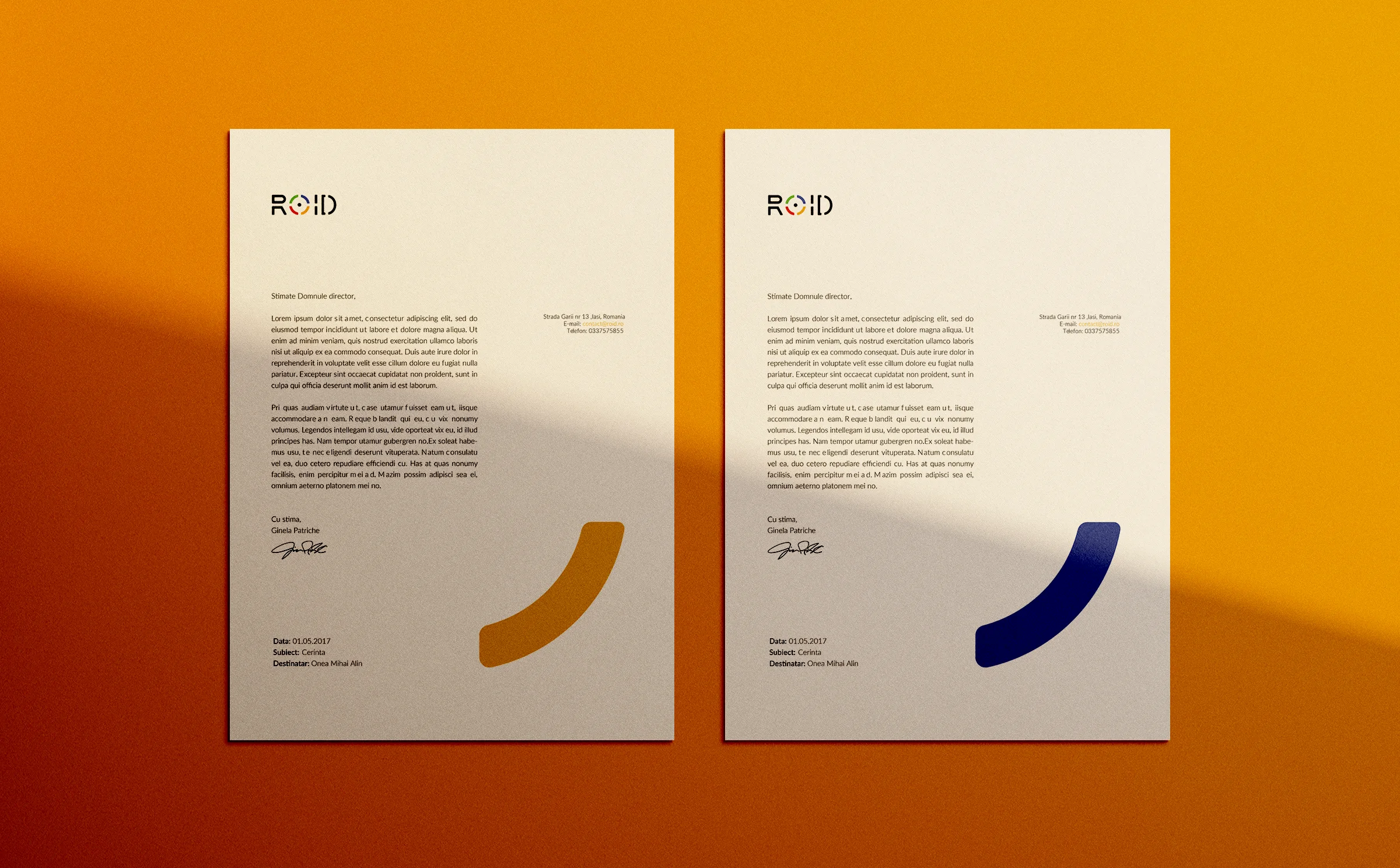
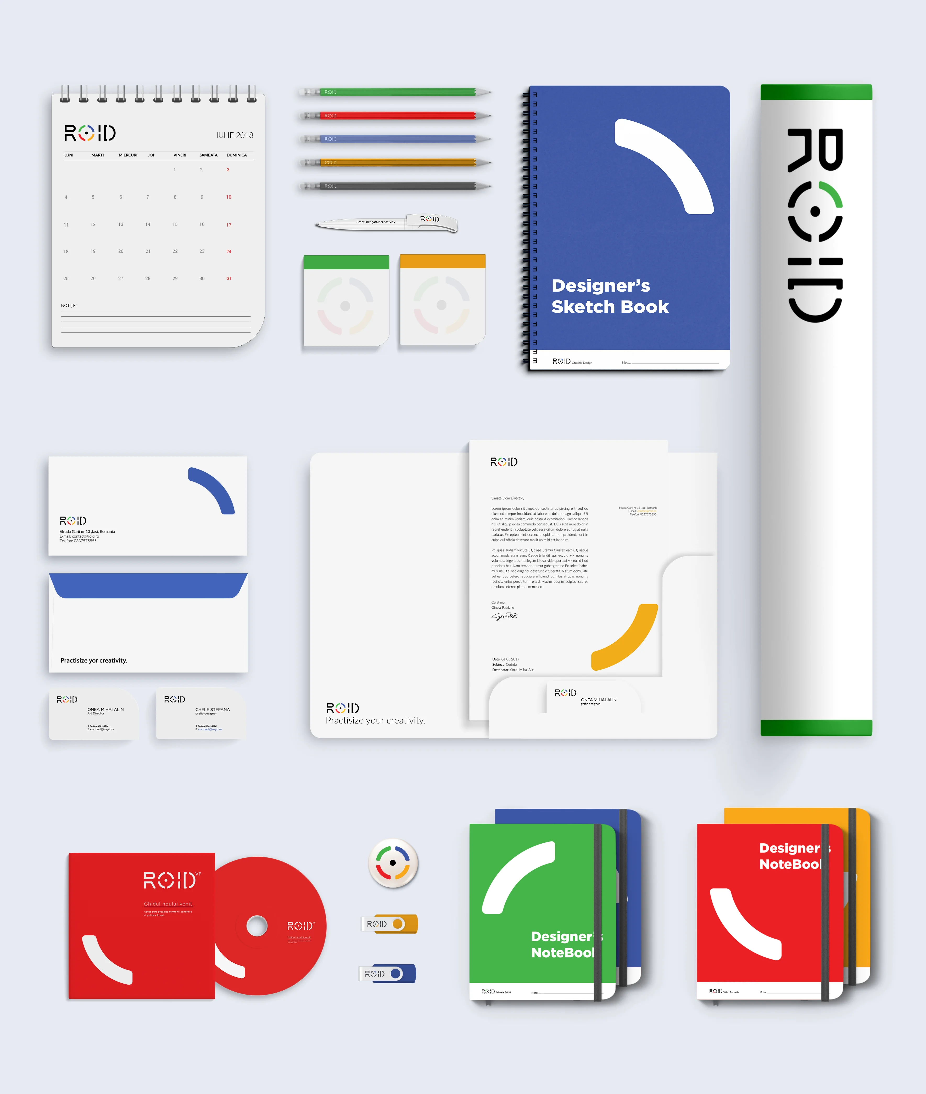
La deuxième étape a impliqué le développement d'une suite de matériaux de marque pour compléter le logo et établir une présence visuelle cohérente. Des cartes de visite, des en-têtes, des modèles de présentation et des matériaux promotionnels ont été conçus en utilisant les couleurs vibrantes du logo et les motifs segmentés. Ces matériaux améliorent non seulement l'image professionnelle de l'entreprise, mais garantissent également la reconnaissance de la marque à tous les points de contact client.
L'utilisation structurée des couleurs et des formes dans ces matériaux renforce le concept de design segmenté, tandis que les mises en page pratiques les rendent fonctionnelles et visuellement attrayantes. Cette phase s'est concentrée sur la création d'une expérience de marque transparente pour les clients et les partenaires.
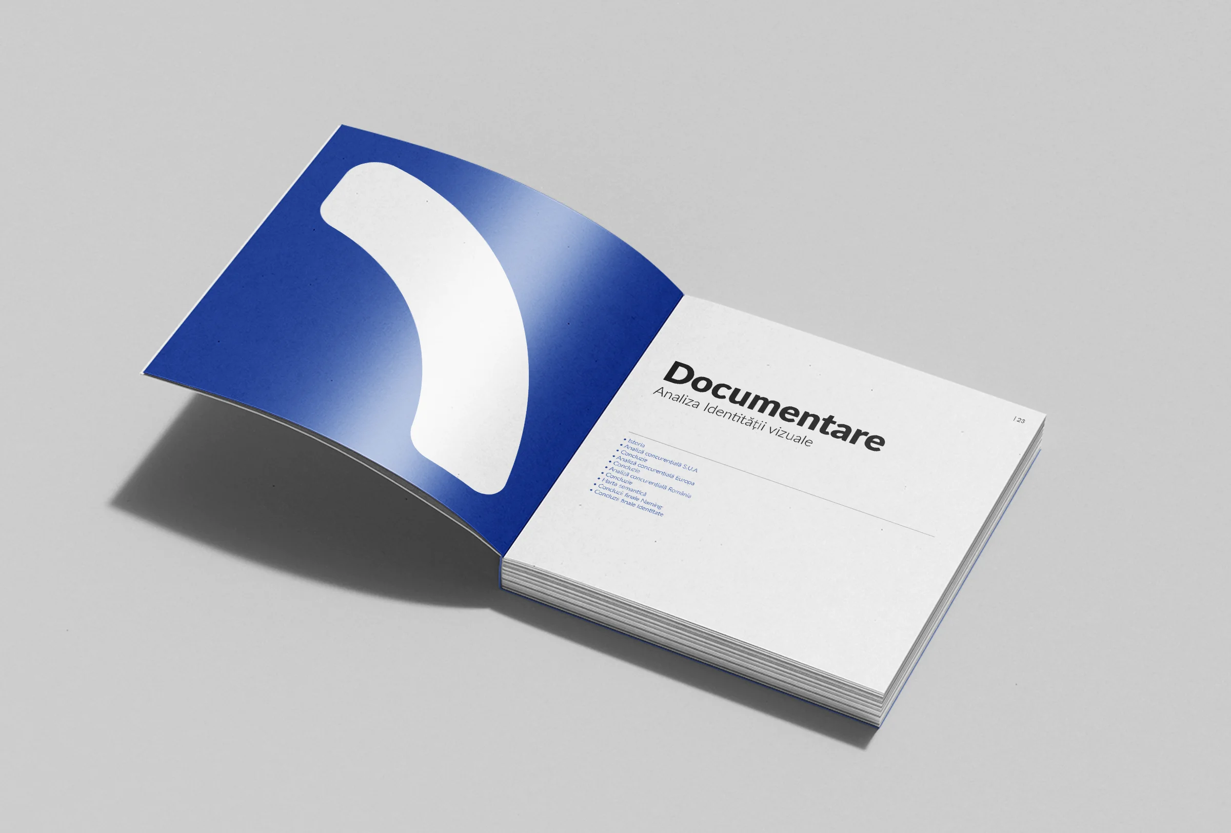
L'étape finale a été la création d'une brochure de marque détaillée. Ce document a capturé l'essence de l'identité ROID, expliquant l'inspiration derrière le logo, ses éléments symboliques et son alignement avec la mission de l'entreprise. Il incluait également des directives de marque pour assurer une application cohérente sur tous les médiums, détaillant les règles d'utilisation du logo, la typographie, les schémas de couleurs et des exemples de mise en page.
La brochure a également exposé le processus de branding, mettant en avant l'approche du design de ROID et soulignant son accent sur la précision et l'innovation. Cette ressource sert à la fois de guide pour les équipes internes et d'outil de présentation pour les clients et collaborateurs.
Le projet de marque ROID a établi avec succès une identité vibrante et polyvalente qui reflète l'expertise créative de l'entreprise et son engagement envers la qualité. Du symbolisme dynamique du monogramme aux matériaux de marque cohésifs et aux directives détaillées, l'identité visuelle assure une image cohérente et professionnelle à tous les points de contact. Cette identité visuelle forte positionne ROID en tant que leader de l'industrie créative, prête à s'engager avec un public diversifié et mondial.