A strong signal-to-noise ratio means every element in a composition serves a clear purpose. It ensures that viewers immediately understand what to focus on and what to ignore. Whether it’s a key visual in an illustration or a call-to-action in a design layout, reducing visual noise helps elevate the signal.
Noise can take many forms: too many fonts, conflicting colors, unnecessary textures, or redundant symbols. When these build up, the viewer is forced to work harder to find meaning. A high signal-to-noise ratio avoids this fatigue, giving the audience what they came for: clarity, emotion, direction.
By removing nonessential elements, adjusting contrast, and refining composition, artists can create visuals that are not only beautiful but purposeful.

How to Achieve It
To improve signal-to-noise ratio, artists begin by identifying the core message of their piece. Then they build the composition around that message, trimming anything that doesn’t reinforce it.
Visual contrast is a key tool. A high-contrast focal point—like a bright object on a neutral background—immediately strengthens the signal. Simplified surroundings allow it to shine.
Color control helps avoid visual chaos. By sticking to a consistent palette and avoiding unnecessary gradients or saturation shifts, artists can create cohesion and clarity.
Typography hierarchy in design follows the same logic: big, bold headlines act as signals, while smaller, subdued text remains in the background.
Whitespace and breathing room are crucial. Removing clutter creates space for the viewer to focus. It’s not about being minimal—it’s about being meaningful.
Common Mistakes
A major mistake is overloading the composition with competing elements. When everything tries to stand out—through bold colors, loud textures, or excessive detail—the viewer can’t find the message. The visual field becomes tiring, and attention is lost.
Another mistake is confusing style for substance. Overdecorating or relying too heavily on trends can weaken the signal, especially if the aesthetic doesn’t serve the message.
Cluttered layouts, inconsistent font usage, excessive icons, or irrelevant graphics all add noise. When artists try to show everything at once, they risk saying nothing clearly. The best compositions lead with intention—not decoration.

Artistic Concepts
Simplify background
A cluttered or overly complex background can quickly drown out the main subject of a composition. Simplifying the background removes visual noise and allows the focal point to stand out more clearly. This doesn’t mean the background must be empty—but it should be purposeful and supportive.
In digital art and illustration, artists often blur or reduce detail in the background so the eye is drawn to the subject. In graphic design, background gradients or solid tones are commonly used to support content without competing for attention. Simplifying the background helps eliminate distraction and strengthens message clarity.
Tone grouping
Tone grouping is the practice of organizing values (light and dark areas) into larger, simplified blocks rather than scattering small tonal shifts across a composition. By grouping tones, artists can create a cleaner structure and reinforce visual hierarchy.
For example, in black-and-white concept art, large shadow shapes contrast with lighter zones to define major areas of interest. In branding and design, color tones are grouped for harmony and legibility. Tone grouping creates a visual rhythm that makes the signal easier to follow.
Sharpen signal
Sharpening the signal means making the main idea or focal point visually dominant and immediately understandable. This can be achieved through contrast, edge clarity, lighting, or design focus.
In UI/UX, a brightly colored button stands out clearly on a neutral background—sharpening the user’s next step. In illustration, the focal character might be rendered in high detail with sharp lines and bright highlights while everything else is softened. Sharpening the signal ensures that the viewer knows exactly where to look first and why it matters.
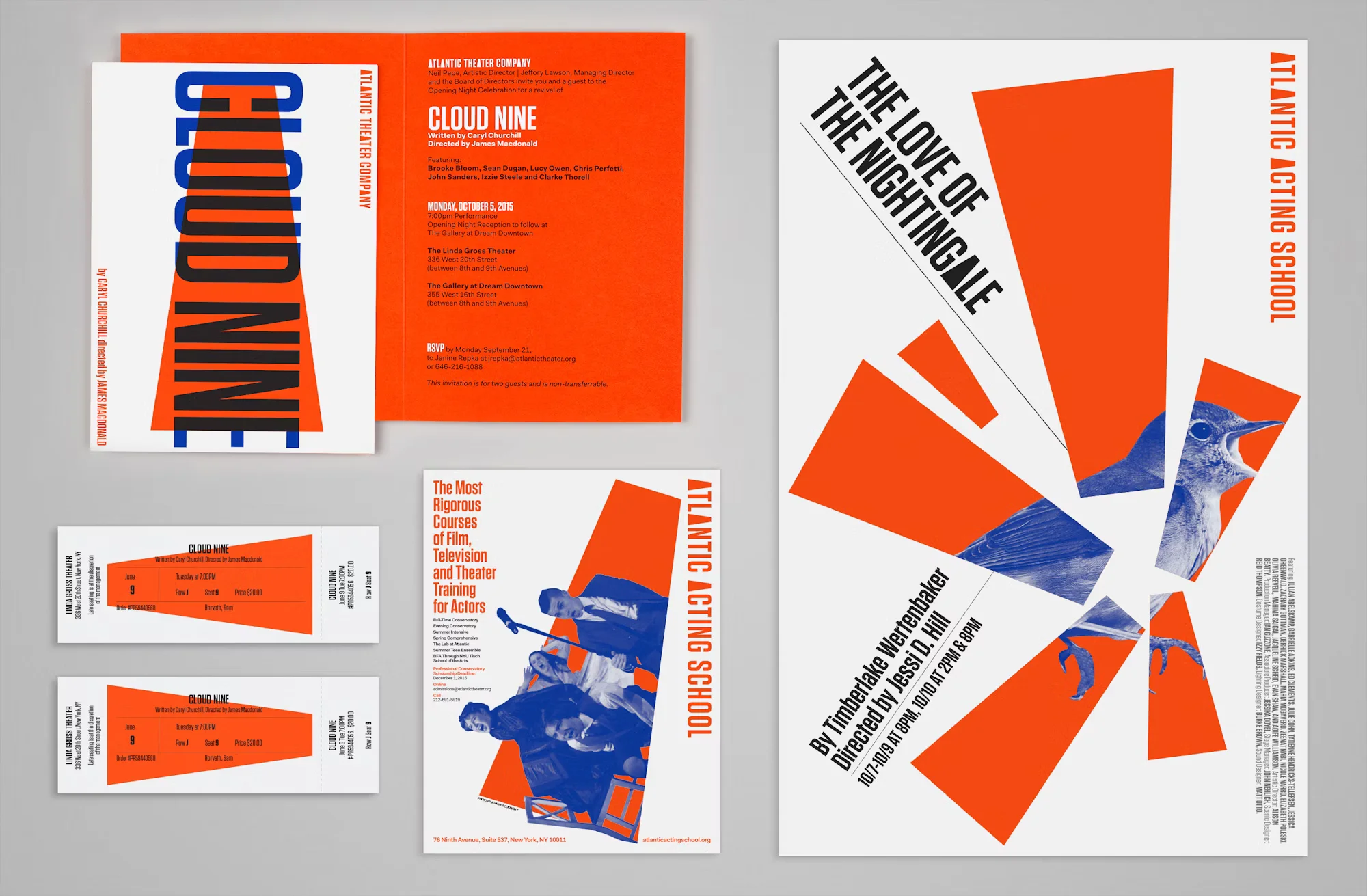
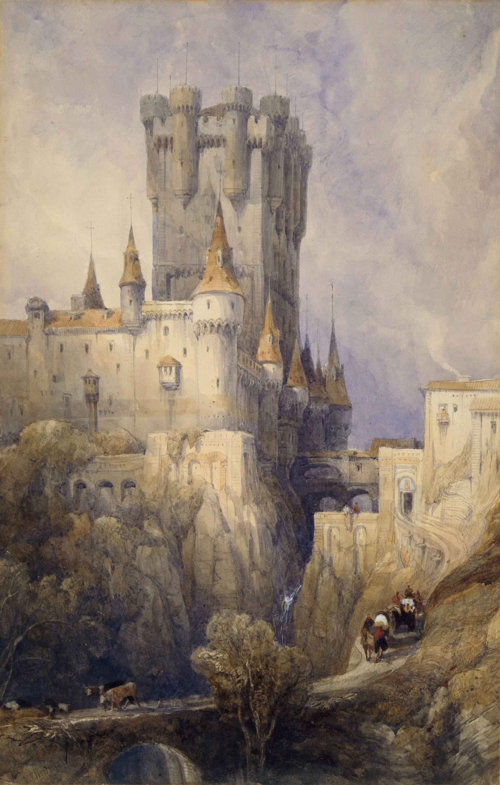
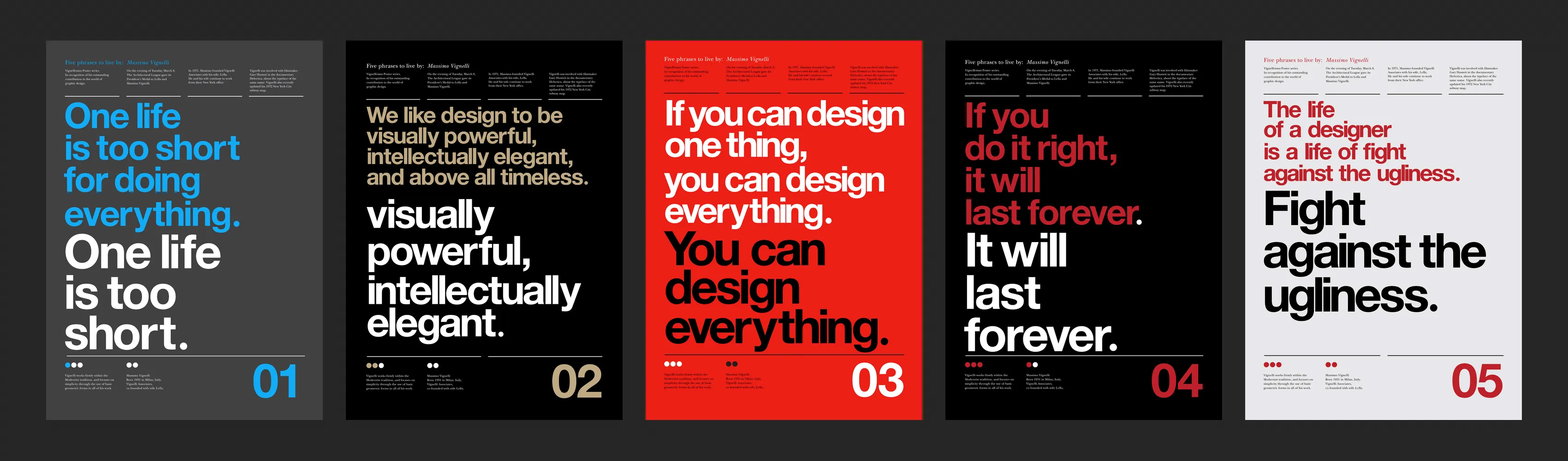
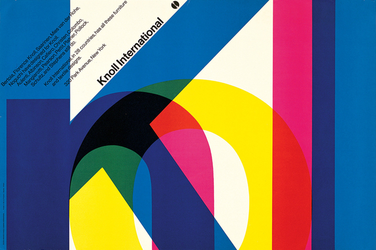
Visual Examples


Why is signal-to-noise ratio important in visual art and design?
It ensures that the viewer can clearly understand the main message without distraction. A strong signal helps guide the eye and keeps engagement high, while minimizing confusion and fatigue.
How can I reduce visual noise in my artwork?
Simplify color schemes, remove unnecessary elements, use whitespace intentionally, and clarify hierarchy. Always ask: does this element serve the message, or does it just add clutter?
Is a minimalist style the only way to apply this principle?
Not at all. Even richly detailed artworks can have a high signal-to-noise ratio. The key is purpose—every element must contribute meaningfully. Whether maximalist or minimalist, clarity always wins.