An effective entry point does more than capture attention—it creates a natural path. It may be a brightly colored shape, a contrasting texture, or the focused gaze of a character. It leads the viewer into the artwork and guides them through the other elements.
A good entry point can also determine the mood. A low-positioned entry may create a grounded, calm effect, while a high or sharply angled one might suggest movement or urgency. In digital art and user interface design, the entry point is often where a viewer clicks or interacts first—meaning its placement is not just aesthetic but functional.
Importantly, entry points work best when they lead somewhere. They should transition smoothly into secondary elements, building a layered experience. The viewer should be invited in, not stuck or overwhelmed at the start.
How to Achieve It
Creating an effective entry point starts with understanding the composition’s focus and visual rhythm. Artists choose where the eye should land first—and why—and then build the rest of the piece to support that path.
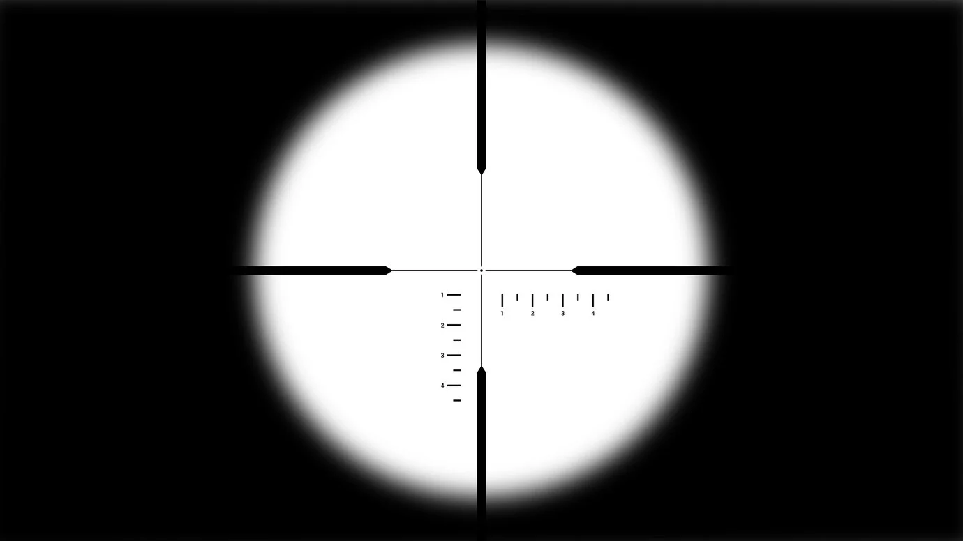
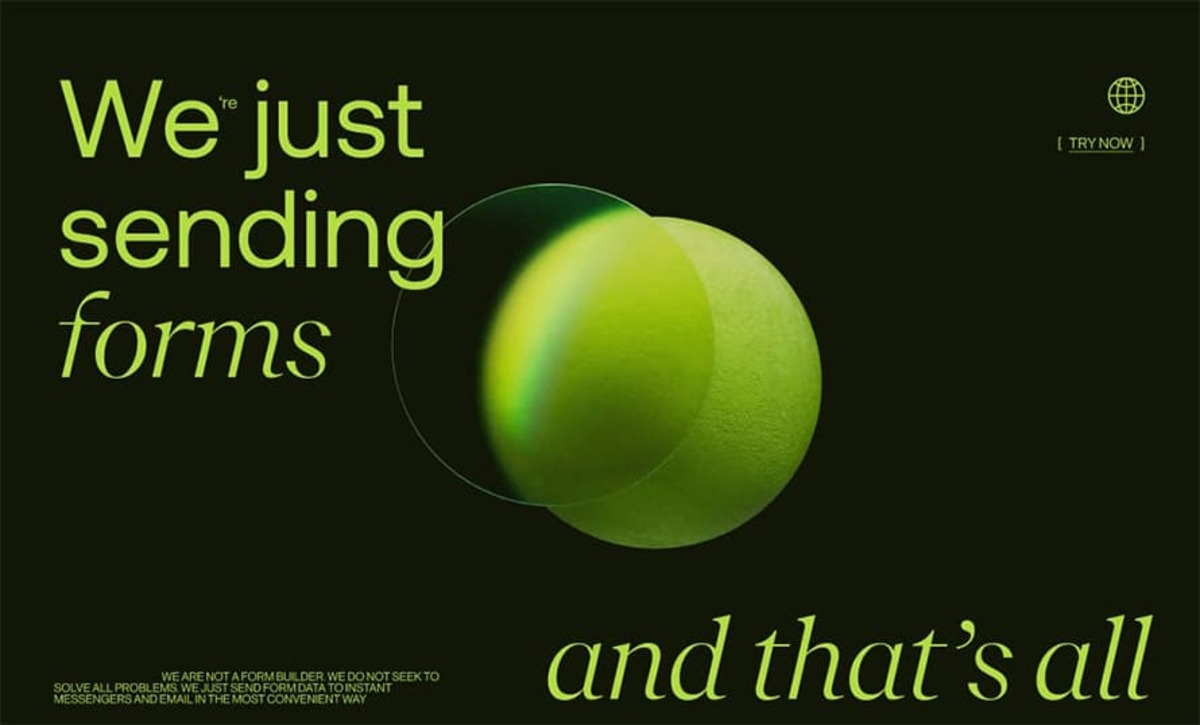
Contrast is one of the most reliable tools. A sharp shift in color, texture, value, or detail can pull the viewer’s attention to a specific area. For example, placing a bright, detailed object against a soft, muted background naturally creates a starting point.
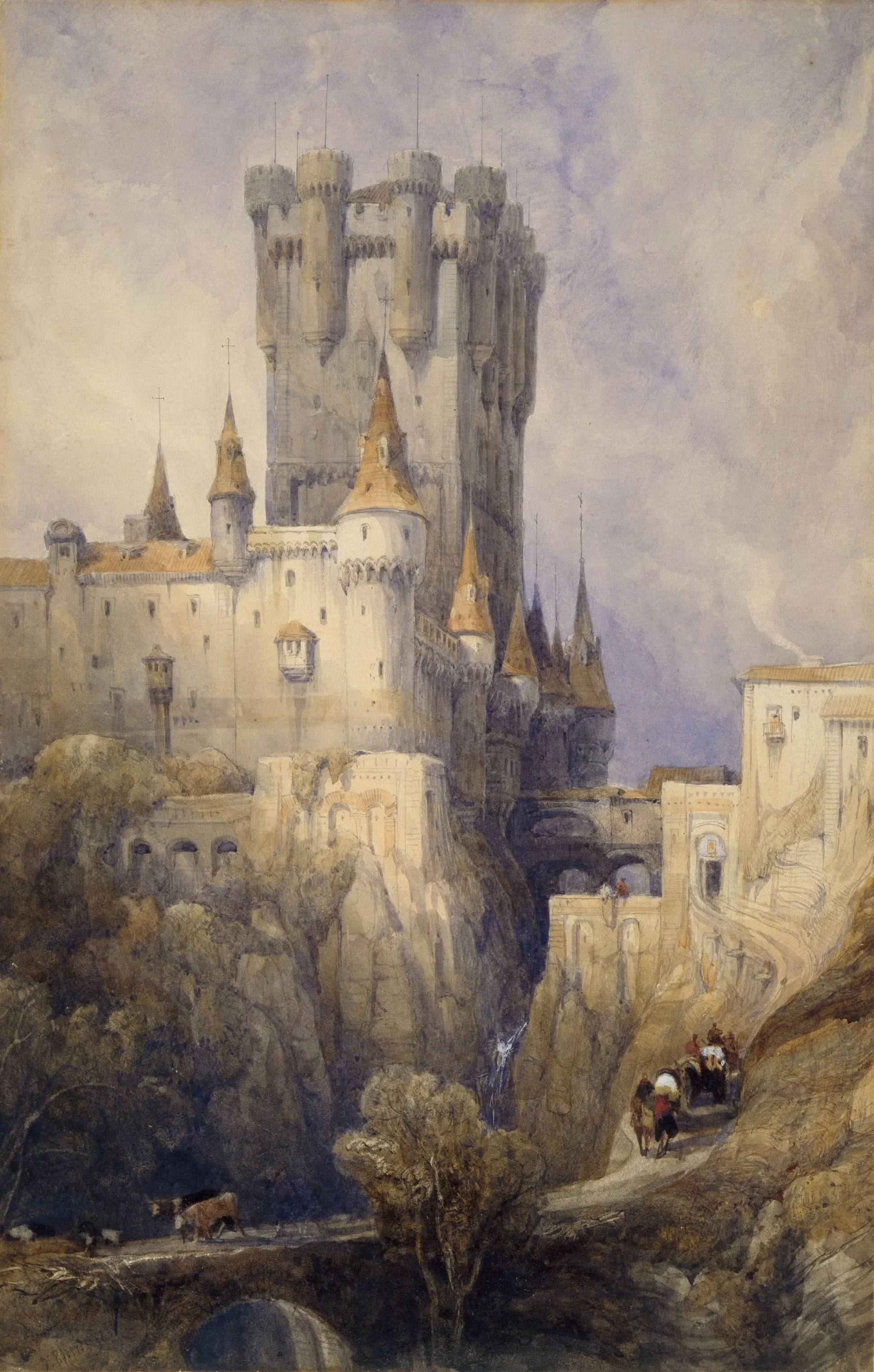
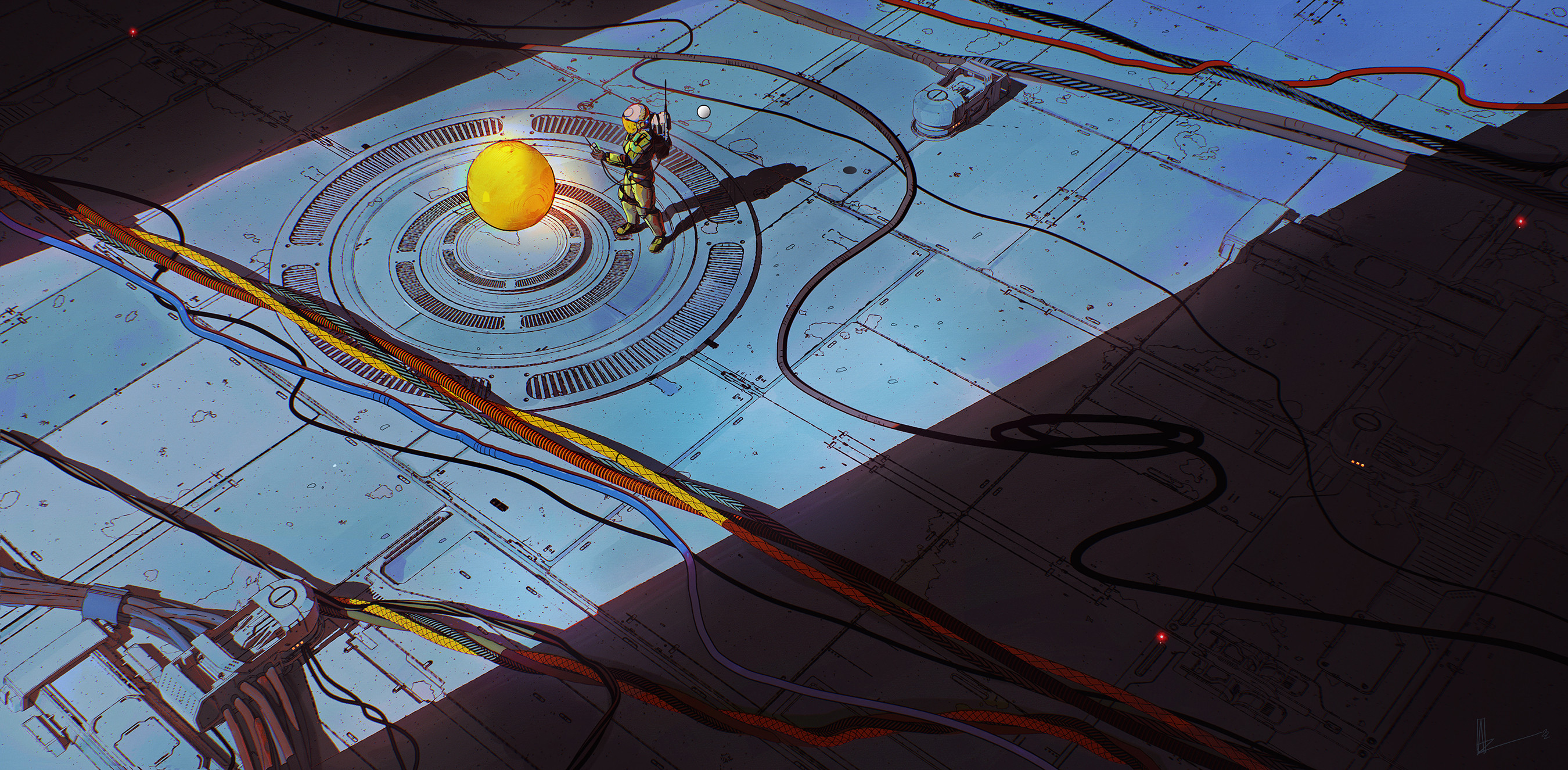
Placement is also critical. Objects located near corners or the top-left (in left-to-right reading cultures) are more likely to be viewed first. Similarly, central figures or strongly lit subjects can act as powerful visual entry points.
Directional cues—such as a figure’s gaze, a pointing gesture, or a leading line—also help establish an entry. These elements suggest motion and gently pull the eye through the composition.
The entry point must feel intentional, but not jarring. If it’s too strong, it can overpower the rest of the piece. If it’s too subtle, the viewer may drift or feel lost.
Common Mistakes
A common mistake is burying the focal point beneath too many competing details. When everything tries to grab attention, the viewer doesn’t know where to begin. The result is confusion or disinterest.
Another issue is placing the entry point too far from visual flow, leading the eye in a direction that breaks continuity. If the entry doesn’t connect smoothly to the rest of the composition, the viewer might disengage early.
Additionally, ignoring visual hierarchy can make the entry point feel weak. If secondary elements overpower the intended starting place, the artwork loses coherence. Entry points need clarity, balance, and thoughtful contrast to be effective.
Artistic Concepts
Focal Point
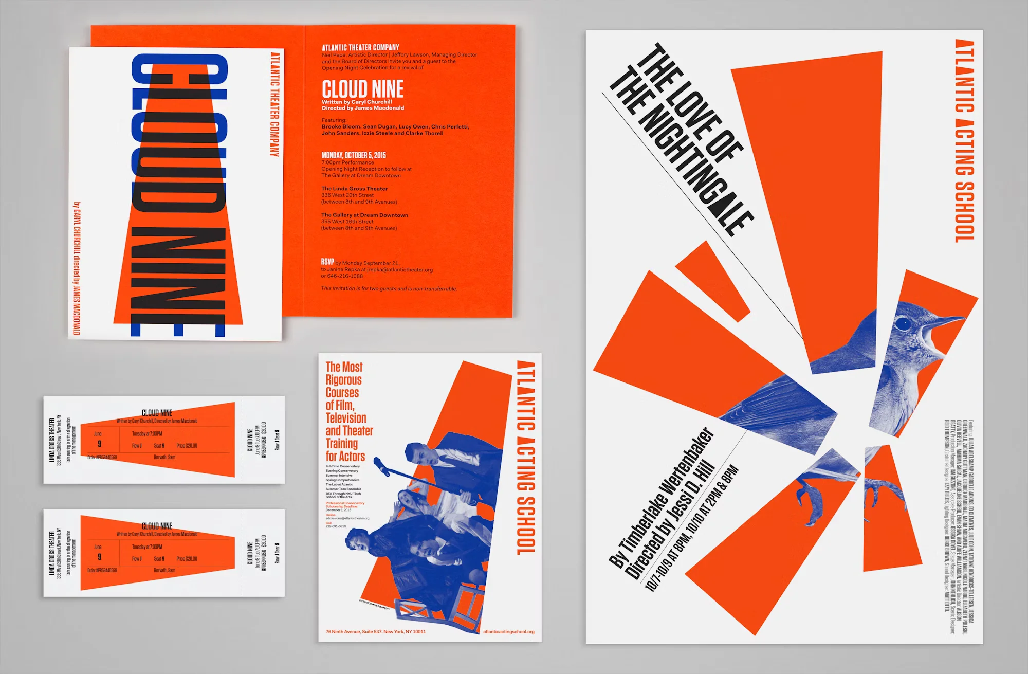
The focal point is often the natural entry into a composition. It’s the element with the most visual weight—whether due to contrast, size, or emotional pull. A strong focal point acts as a visual magnet, inviting the viewer to pause and begin their journey through the artwork.
In digital art, this might be a character’s face rendered with high detail and sharp lighting. In editorial illustration, it could be a bold title or image at the top of the layout. Focal points need clarity and emphasis, but they also need support from the rest of the composition to maintain visual flow.
Framing
Framing is the use of surrounding elements to guide the eye toward the entry point. It can be literal—like a doorway or window—or more abstract, like a change in color or texture that creates visual boundaries around a focal area.
In illustration and photography, natural frames like foliage or architectural structures subtly lead the viewer to the intended point of entry. In graphic design, negative space can act as a frame, isolating the entry point and giving it prominence. Effective framing sets up the focal area and draws the eye inward.
Focus
Focus refers to the level of clarity and sharpness given to specific parts of the artwork. A high level of detail or contrast will naturally attract the eye, while blurred or simplified areas recede into the background.
In digital painting, the artist might apply strong highlights and crisp edges to one area while letting the surrounding parts fade softly, ensuring the viewer knows exactly where to look first. In UI/UX design, a focused button or interaction point ensures a seamless visual entry into the experience. Managing focus allows artists to prioritize content and direct engagement with precision.
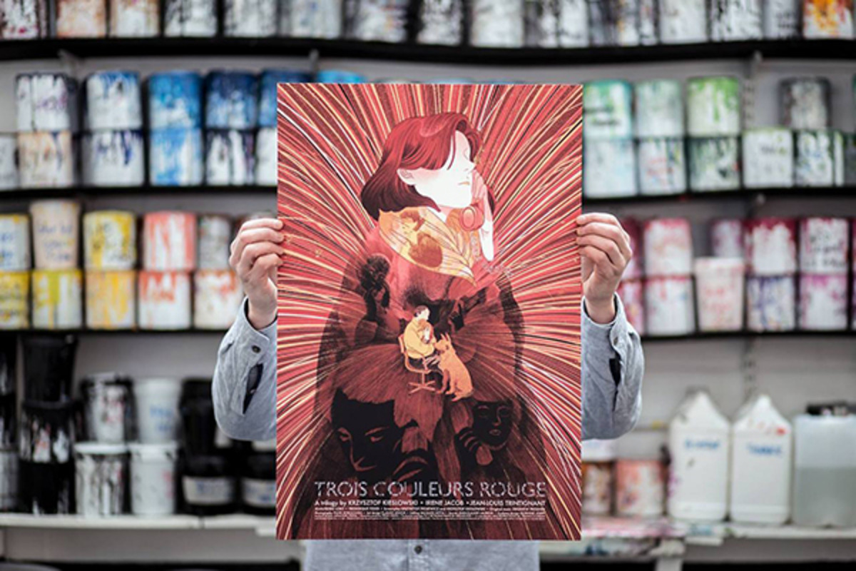
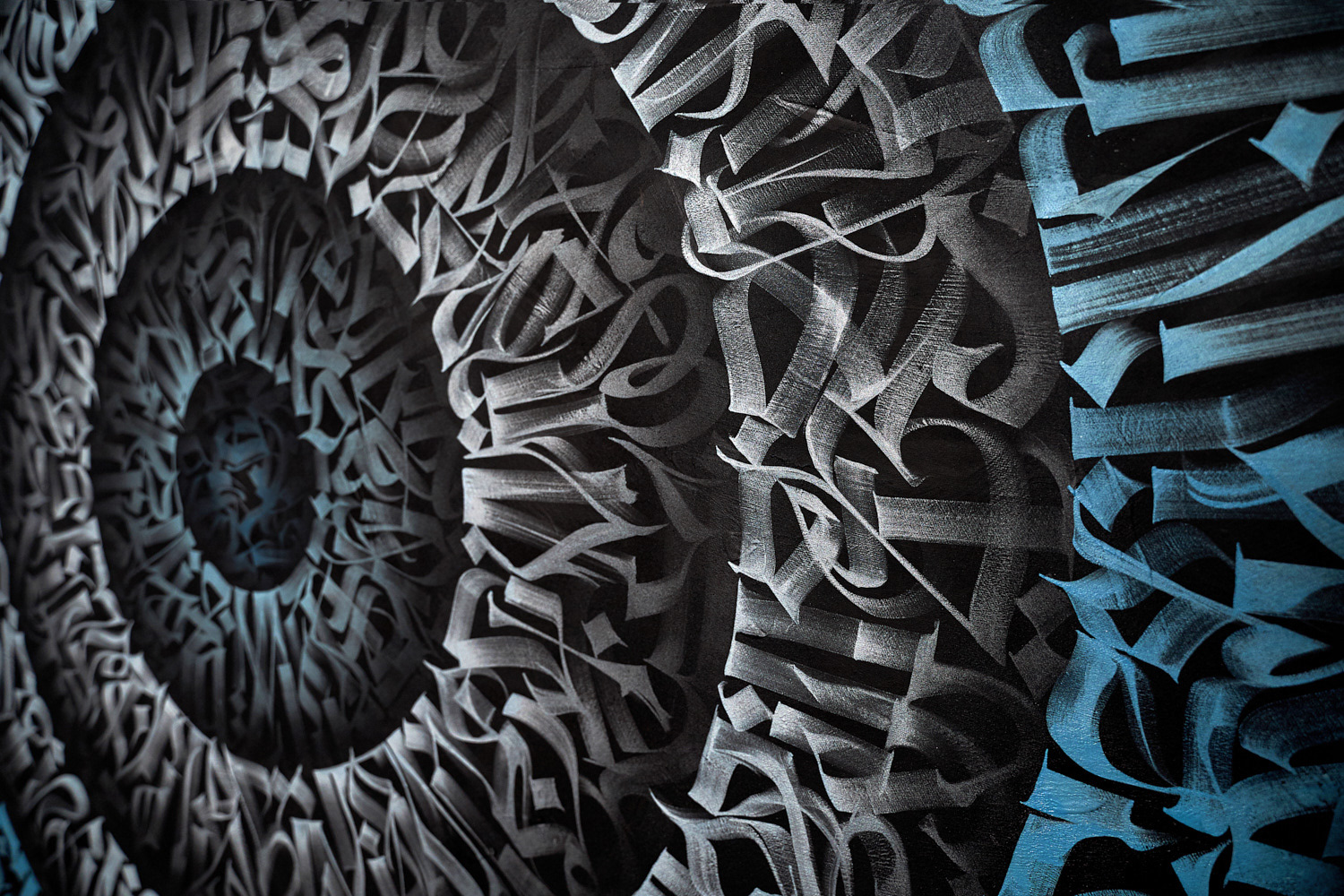
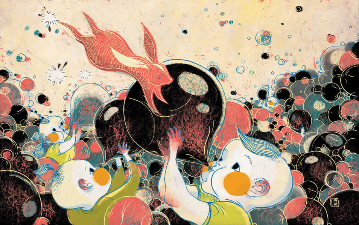
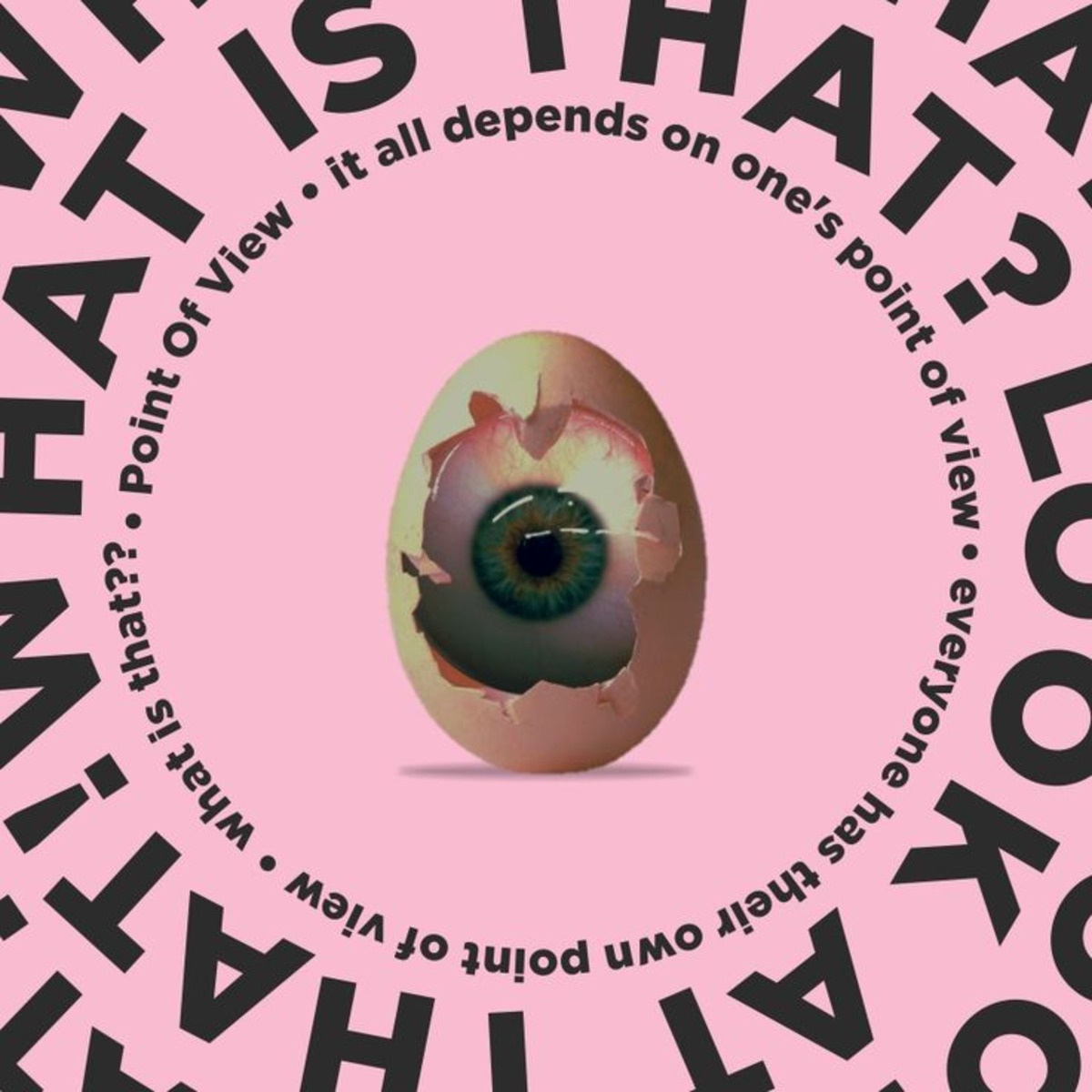
Visual Examples
Why is the entry point important in a composition?
The entry point sets the stage for the entire visual experience. It’s the first connection between the viewer and the artwork. A strong entry point helps direct attention, structure the journey through the piece, and reinforce the intended message.
How do artists create entry points in digital art?
Digital artists use contrast, lighting, color, and placement to guide the viewer’s attention. They often isolate key elements or enhance them with detail, blur surrounding areas, or use visual cues like gestures and gaze direction to establish entry.
Can entry points be subtle?
Yes. Entry points don’t always need to be bold or central. A subtle glow, a shift in tone, or a guiding shape can be just as effective. The goal is to create a natural beginning, not a visual interruption. Subtle entry points often work best in calm or minimalist compositions.