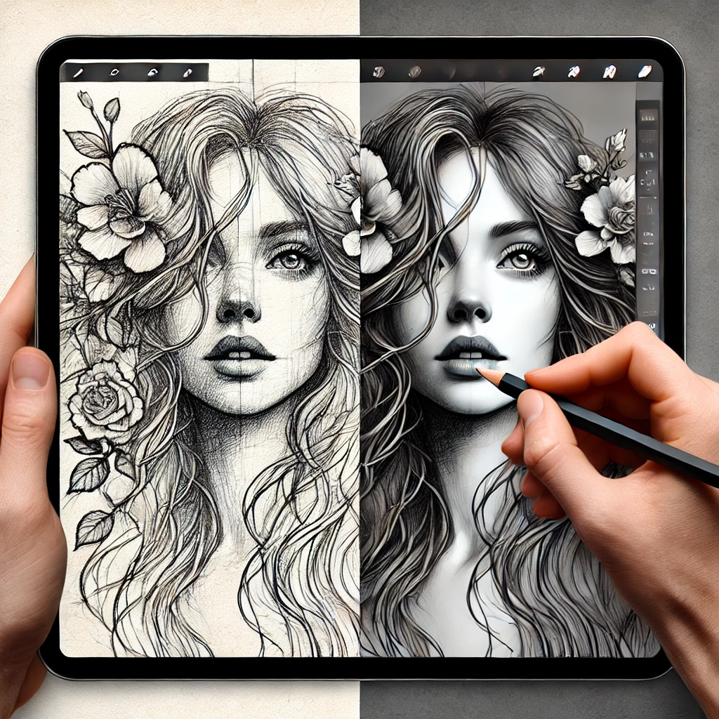
Understanding texture in digital art
Texture in digital illustration refers to the visual representation of surface qualities, ranging from soft and smooth to rough and gritty. It helps define materials and enhances the overall mood of an artwork. Some artists use subtle textures to add depth, while others make texture the defining feature of their style.
Soft textures are used to create smooth transitions and gentle gradients, often seen in digital paintings and airbrushed effects. Rough textures incorporate visible brushstrokes, grain, or noise to give illustrations an organic and hand-crafted feel. Patterned textures add structure and repetition, often used in stylized or decorative designs. The choice of texture depends on the subject, style, and emotion an artist wants to convey.
Digitale penselen gebruiken voor textuur
One of the easiest ways to introduce texture into digital illustration is through the use of digital brushes. Most professional illustration software, including Photoshop, Procreate, and Clip Studio Paint, offers a range of brushes designed to simulate traditional media. The type of brush used significantly affects the final look of an illustration.
Pencil and charcoal brushes are great for sketching and shading, offering a natural, grainy feel. Oil and watercolor brushes replicate the fluid, layered qualities of traditional painting, giving illustrations a dynamic and expressive look. Texture brushes add specific surface details like paper grain, fabric weaves, or scratchy surfaces, enhancing realism or stylization. Custom brushes allow artists to create unique textures tailored to their personal style, helping them develop a distinct artistic voice.
By adjusting brush opacity, pressure sensitivity, and blending modes, artists can control how texture appears in their work. Experimenting with different brushes and layering techniques allows for greater versatility and expression.
Laagtechnieken voor realistische textuur
Layering is another powerful technique for adding texture in digital illustration. By building up multiple layers with different textures and blending effects, artists can create depth and complexity.
Het overlappen van korrel of ruis op een aparte laag kan subtiele textuur toevoegen zonder de basisillustratie te overheersen. Het gebruiken van textuurkaarten, zoals gescande papieren texturen of fotografische oppervlakken, geeft een organisch gevoel wanneer ze goed worden gemengd. Schilderen met textuurpenselen op individuele lagen biedt betere controle, waardoor je gemakkelijk kunt aanpassen of wissen zonder de hele illustratie te beïnvloeden.
Layer masks are useful for refining texture placement, ensuring that it enhances the image without distracting from the focal points. Keeping textures on separate layers also allows for experimentation, making it easier to modify or enhance different sections of an illustration without losing flexibility.
Diepte en realisme creëren met textuur
Texture plays a key role in making surfaces feel tangible and realistic. The way an object interacts with light, shadow, and color determines how its texture is perceived. Different materials require different approaches to texture application.
Skin texture should have subtle variations in tone and surface detail to avoid looking overly smooth and artificial. Adding slight noise or soft brush strokes helps maintain a natural appearance. Fabric texture needs to follow the folds and flow of clothing, mimicking the weave and softness of different textiles. Rough textures, such as wood grain, stone, or fur, should have directional strokes that reinforce the shape and structure of the object.
Studying real-world references helps artists understand how different surfaces behave. Observing how light interacts with textures in nature, photography, or traditional media can provide valuable insight into applying texture in digital illustrations effectively.
Gestileerde versus realistische textuur
Texture can be used to achieve both realistic and stylized effects, depending on the artistic approach. Realistic textures focus on replicating fine details to make objects look tangible. Artists working in concept art, game design, and digital painting often rely on high levels of textural detail to create immersive and believable scenes.
Stylized textures exaggerate or simplify surface details to create a distinctive artistic effect. Comic book illustrations, animated backgrounds, and children’s book art often use bold, expressive textures that enhance visual appeal without focusing on realism. Minimalist textures keep surfaces clean and smooth, favoring simplicity over complexity. This approach works well in vector-based illustration and flat design.
Finding the right balance between texture and clarity is essential. While detailed textures add depth and interest, excessive texture can overwhelm an image and make it difficult to read. Experimenting with different levels of detail helps create a composition that feels balanced and visually appealing.
Veelvoorkomende fouten bij het toepassen van textuur
Texture is a powerful tool, but misusing it can weaken an illustration rather than enhance it. One of the most common mistakes is using too much texture uniformly across an image, which can make everything feel visually cluttered. Variation in texture intensity helps create focal points and contrast.
Applying texture randomly without following the form of an object can make an illustration feel unnatural. Textures should wrap around surfaces in a way that reflects their shape, direction, and interaction with light. Ignoring material differences can also lead to inconsistencies. A metallic surface should feel smooth and reflective, while a stone surface should appear rough and irregular. Mixing materials in an illustration requires careful consideration to ensure each element looks distinct yet cohesive.
Te veel vertrouwen op textuurpenselen zonder juiste mengtechnieken kan een afbeelding kunstmatig laten aanvoelen. Hoewel textuurpenselen nuttig zijn, moeten ze gecombineerd worden met schildertechnieken die ze natuurlijk in de compositie integreren.
Conclusion: Texture is a crucial aspect of digital illustration, enhancing depth, realism, and artistic expression. Whether aiming for a smooth, polished look or a rough, painterly effect, mastering texture techniques allows artists to create visually engaging and immersive artwork. Understanding how to use digital brushes, layering techniques, and stylized texturing helps develop a unique artistic voice. With practice and experimentation, texture can transform a flat digital image into a dynamic and compelling piece of art.
Hoe voeg ik textuur toe aan mijn digitale illustraties?
Textuur kan worden toegevoegd met gespecialiseerde penselen, het overlappen van textuurlagen, of het toepassen van ruis- en korrel-effecten. Laagmengmodi zoals Vermenigvuldigen of Overlay helpen texturen naadloos te integreren. Aangepaste penselen en fotografische texturen kunnen ook oppervlaktedetails verbeteren voor meer realistische effecten.
What is the best way to create realistic textures in digital art?
Het bestuderen van texturen uit de echte wereld en het gebruiken van referentiebeelden verbetert het realisme. Observeren hoe licht interacteert met verschillende materialen helpt bij het bepalen van de juiste schaduwen en highlights. Het gebruiken van getextureerde penselen met druksensitiviteit en het aanpassen van de dekking zorgt ervoor dat texturen natuurlijk in een illustratie worden gemengd.
Should I use texture in all my illustrations?
Not all illustrations need heavy texture. Some styles benefit from clean, smooth finishes, while others require rough, organic details. The amount of texture depends on the artistic intent. Using it strategically, rather than applying it everywhere, helps maintain balance and clarity in an illustration.