メトロレックス - 誘導システム
The result is a clean design, a modern and legible font, and vibrant colors to clearly differentiate metro lines and destinations, thus facilitating orientation and reducing confusion. A visual system that places Metrorex among international metro systems.
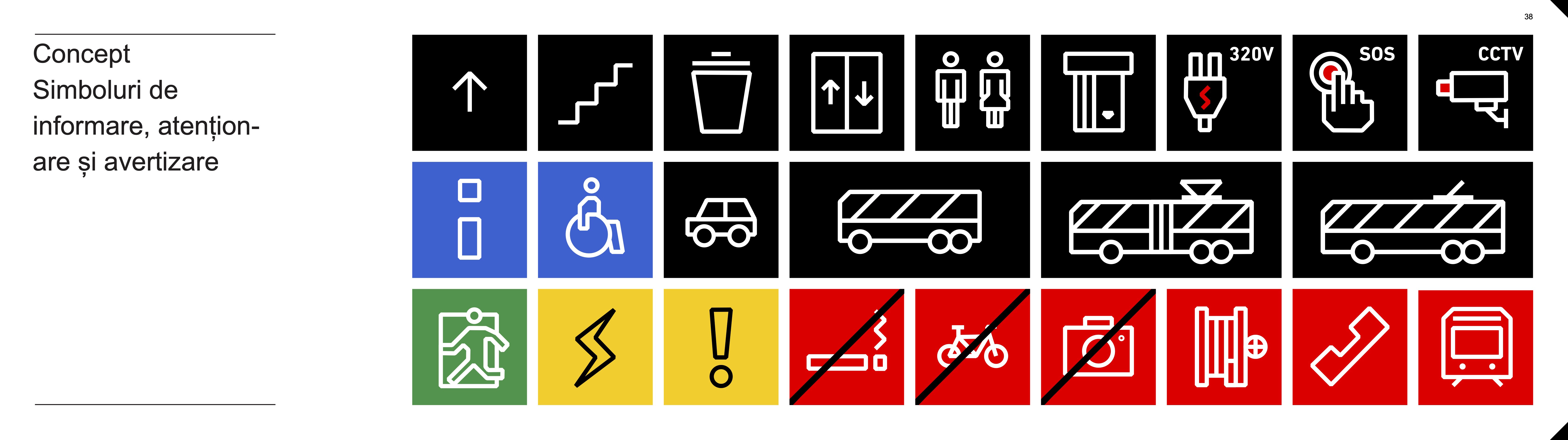
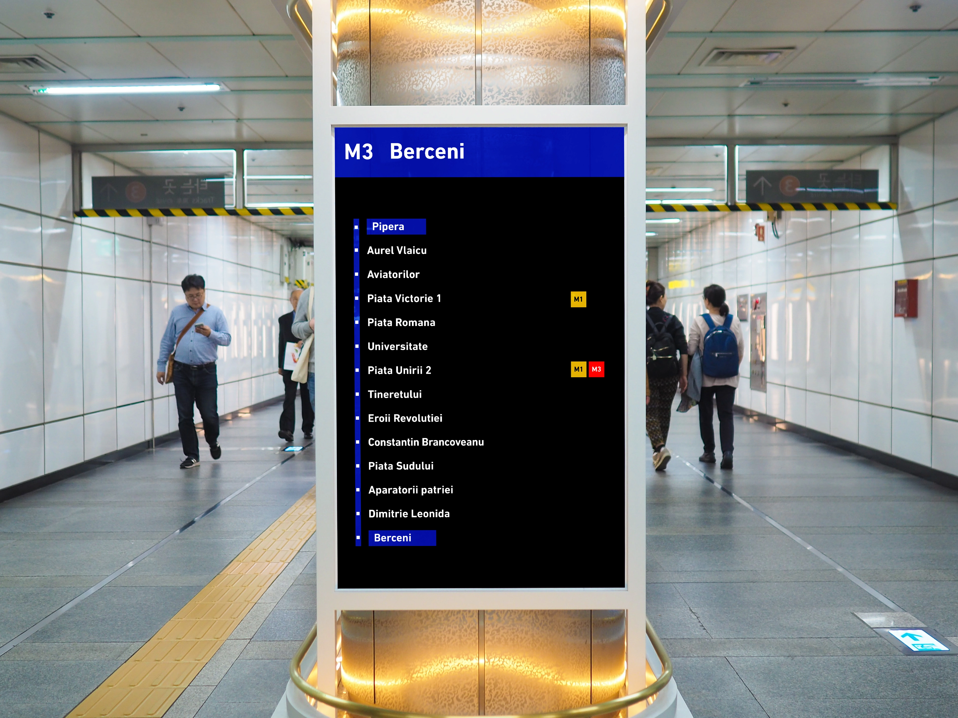
The strong contrast between black and white ensures maximum visibility, while information panels indicate routes and stations for each line, using specific colors for lines M1, M2, and M3. Directional signs are intuitive, with universal symbols and clear text to guide travelers to platforms, exits, and other facilities, while route maps highlight major stations and line intersections, facilitating travel planning.
The system enhances user experience by reducing stress and orientation time, and is accessible to visually impaired individuals due to strong contrasts and easily understandable symbols. The minimalist and modern design contributes to a contemporary image of the Metrorex network, aligning with international standards.
This wayfinding system not only considerably improves navigation within the Bucharest metro network but also brings aesthetic and functional value, aligning with modern trends in public transport design.